Advanced Graph Sketcher, Data Generator & Chart Visualizer Pro Version 4.2 Extreme Edition (Custom Variables + Fixed Wavelets)
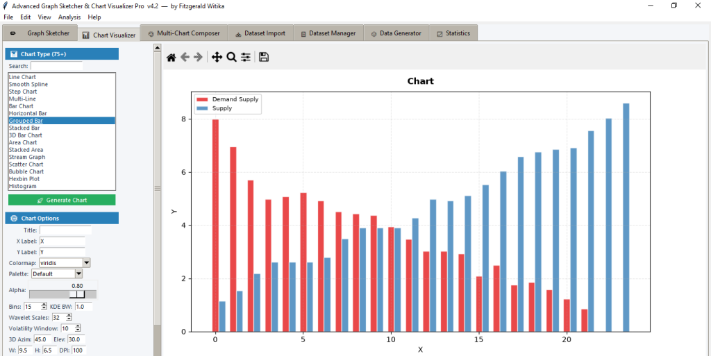
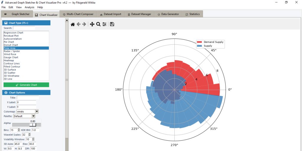
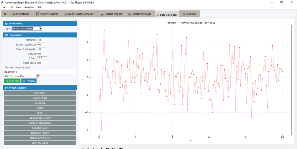
Advanced Graph Sketcher, Data Generator and Chart Visualizer Pro v4.2 Extreme Edition is a complete desktop workspace for drawing data by hand, generating synthetic series, importing real datasets and turning them into more than seventy five professional chart types. Users click on a canvas to place points, edit them, fit curves and assign each series its own style. A dedicated Multi Chart Composer lets every variable use a different visual form on the same figure. Custom variables mark events such as pandemics, recessions or policy windows as shaded bands, lines or markers. Built in wavelet transforms, volatility tools, statistics and high resolution export complete a single application that serves teaching, analysis and publication.
Academic value
Lecturers and students in statistics, economics, physics, engineering and the social sciences obtain an interactive laboratory that covers sketching, simulation and advanced visualisation. Coursework can begin with students clicking points to learn coordinate systems, then move to generated distributions, imported survey files and finally wavelet scalograms or correlation contours. The custom variable engine lets a class overlay a COVID period or a policy shock on any time series so that students see how events sit inside the data. Regression, residual plots, Q Q plots and descriptive reports give immediate numerical backing for lab reports. Publication quality PNG, SVG and PDF export means figures leave the classroom ready for theses and journal articles. Standalone sessions remain lightweight so computer labs need only Python and the listed scientific packages.
Corporate value
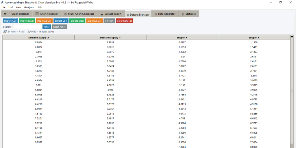
Analysts, finance teams and operations staff use the same canvas to import Excel or CSV files, map columns to axes and produce board ready graphics in minutes. Volatility zig zag, Bollinger style bands, candlestick and OHLC charts serve trading and risk desks. Funnel, gauge, treemap and waterfall charts support marketing and management reporting. The Multi Chart Composer places a line, a bar and an area on one figure so that different metrics stay visually distinct. Custom variables highlight campaign windows, outages or regulatory periods without extra drawing software. Curve fitting, moving averages and drawdown plots turn raw numbers into decision support. Exports in image and spreadsheet formats feed slide decks and shared folders while the point editor lets a manager correct an outlier before the chart is circulated.
Policy sphere value
Ministries, central banks and research units can load official time series, mark legislative or crisis intervals with custom variables and produce contour, heatmap and coherence plots that communicate cycles and co movement. Wavelet power spectra and rolling correlation contours help identify when relationships between indicators strengthen or break. Event markers and shaded bands make policy briefs immediately readable for non specialists. High resolution figures and statistical summaries travel from the analyst’s desk into cabinet papers or public reports. The application therefore functions both as an internal laboratory and as a communication tool that keeps the visual language consistent across teams.
Trying the software is free of charge. You can run the full program until the trial version expires. After that you may subscribe for one month at K300 if you are a Zambian client or 50 US dollars if you are located outside Zambia. Payment method is open to discussion so that we can accommodate the channel you prefer. You may cancel the subscription at any time. Please subscribe to continue using this software.
For subscription assistance please contact us by email at resgroup@research-expert-solutions.com. Alternatively, for a prompt response, you can call or send us a WhatsApp message on +260 972 412 315.