FitzStatistics is an advanced desktop based statistical software suite designed to support comprehensive data analysis and visualization across multiple research domains. The platform integrates several specialized analytical tools that enable researchers to analyze quantitative, qualitative, categorical, and time series data using modern statistical and visualization techniques. Key components of the system include the Contour Chart Generator for three dimensional data visualization, the Advanced Data Visualization with Statistics module for relational and hierarchical diagrams, the Advanced Qualitative Data Visualizer for categorical and thematic analysis, the Quantitative Data Analysis Tool for econometric and statistical modeling, the FitzSet Theory Data Analyzer for set theoretic analysis, and the Time Series Component Analysis Tool for temporal decomposition and forecasting.
The software was developed by Fitzgerald Witika, Founder of Research Expert Solutions, with the objective of providing researchers, analysts, and academics with a comprehensive yet accessible platform for rigorous statistical analysis. By integrating established computational libraries and scientifically validated analytical methods, FitzStatistics offers credible, reliable, and publication ready analytical outputs suitable for academic research, professional analysis, and advanced data exploration.
Contour Chart Generator
Tool Description
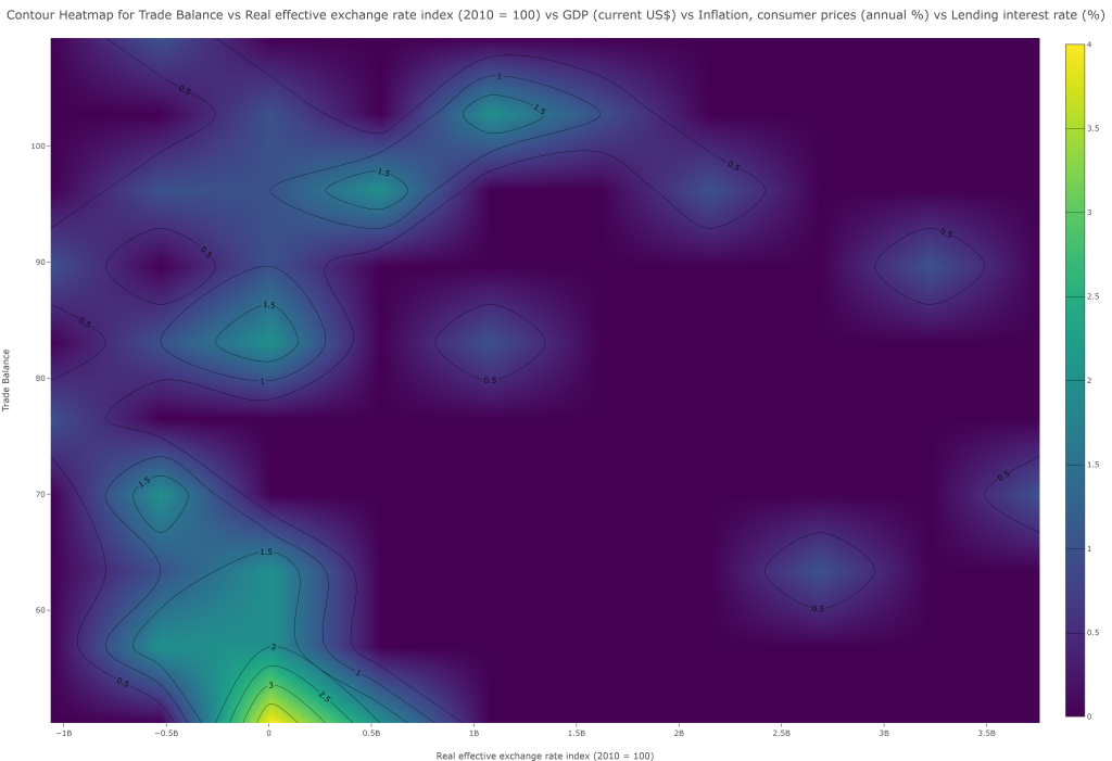
The Contour Chart Generator in FitzStatistics is a specialized visualization engine dedicated to creating topographical and density-based representations of three-dimensional data relationships. As a desktop application tool, it transforms complex multivariate datasets into interpretable contour maps, heatmaps, and surface plots that reveal the underlying structure and gradients within numerical data. The tool supports seamless import from CSV and Excel files, with an intuitive three-step workflow: data import with preview table, variable selection for X, Y, and Z axes with optional color variable assignment, and extensive chart customization options. Users can choose from over twenty distinct contour visualization types including basic contours, filled contours, contours with overlaid data points, logarithmic contours, polar contours, ternary contours, 2D density maps, stacked contours, multi-contour overlays, animated sequences, and interactive variants. The interface includes a comprehensive color scale selector with scientific palettes (Viridis, Plasma) and custom color specification, enabling precise control over the visual encoding of the Z-axis values.
Application and Analysis Type
This tool is exclusively designed for quantitative data analysis, specifically for visualizing continuous, gridded, or scattered three-dimensional data where the relationship between two independent variables (X and Y) and a dependent variable (Z) needs to be examined. The contour methodology is particularly valuable in fields such as geography (topographic mapping), meteorology (pressure and temperature gradients), physics (potential fields), engineering (stress distribution), and environmental science (pollutant concentration mapping). The tool’s ability to overlay multiple contours with user-defined colors enables comparative analysis of different variables on the same spatial domain, while the inclusion of 3D surface and wireframe visualizations provides enhanced perspective on data topography. The 2D density and histogram contour variants offer robust solutions for exploring bivariate distributions and identifying clusters, outliers, and density patterns in large datasets. The animated and interactive contour options facilitate temporal analysis, allowing researchers to observe how spatial patterns evolve across time points or experimental conditions. The ternary contour capability extends the tool’s utility to compositional data analysis common in chemistry, geology, and material science where three components sum to a constant.
Credibility and Validity of Methodology
The Contour Chart Generator employs industry-standard interpolation and rendering algorithms through the Plotly library, which has been rigorously validated for scientific visualization applications. The contour generation process utilizes mathematically sound techniques for isarithm mapping, where continuous surfaces are constructed from discrete data points through methods such as linear interpolation, nearest-neighbor, or more sophisticated algorithms that preserve topological consistency. The tool’s implementation of logarithmic axes for contour plots enables proper handling of data spanning multiple orders of magnitude, a critical requirement in many scientific disciplines. The color scale selection includes perceptually uniform schemes like Viridis and Plasma that have been scientifically validated to preserve data fidelity and ensure accessibility for colorblind viewers. The overlay capabilities maintain proper z-ordering and transparency handling, ensuring that multiple contour layers do not obscure one another illegitimately. The 3D surface and wireframe visualizations employ proper perspective rendering with configurable lighting and opacity, providing accurate spatial perception of data topography. The histogram contour functionality implements kernel density estimation with appropriate bandwidth selection, yielding statistically valid representations of bivariate distributions. The export functionality leverages Plotly’s high-fidelity rendering engine to produce publication-quality images at specified resolutions, while the screenshot capability using html2canvas provides an alternative capture method that includes all custom styling. By relying on established mathematical principles for contour generation and providing transparent control over visualization parameters, the Contour Chart Generator maintains the highest standards of analytical validity while offering researchers powerful tools for exploring and communicating three-dimensional data relationships.
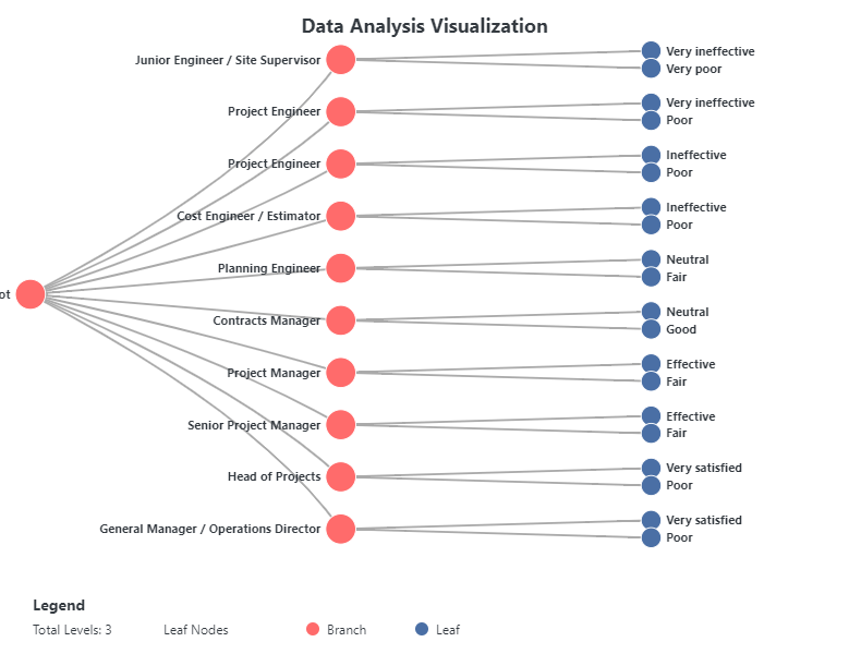
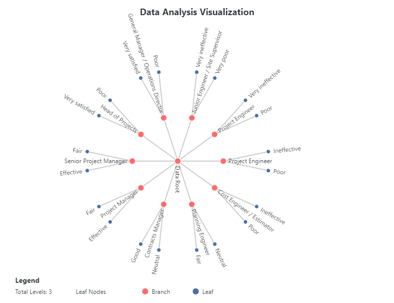
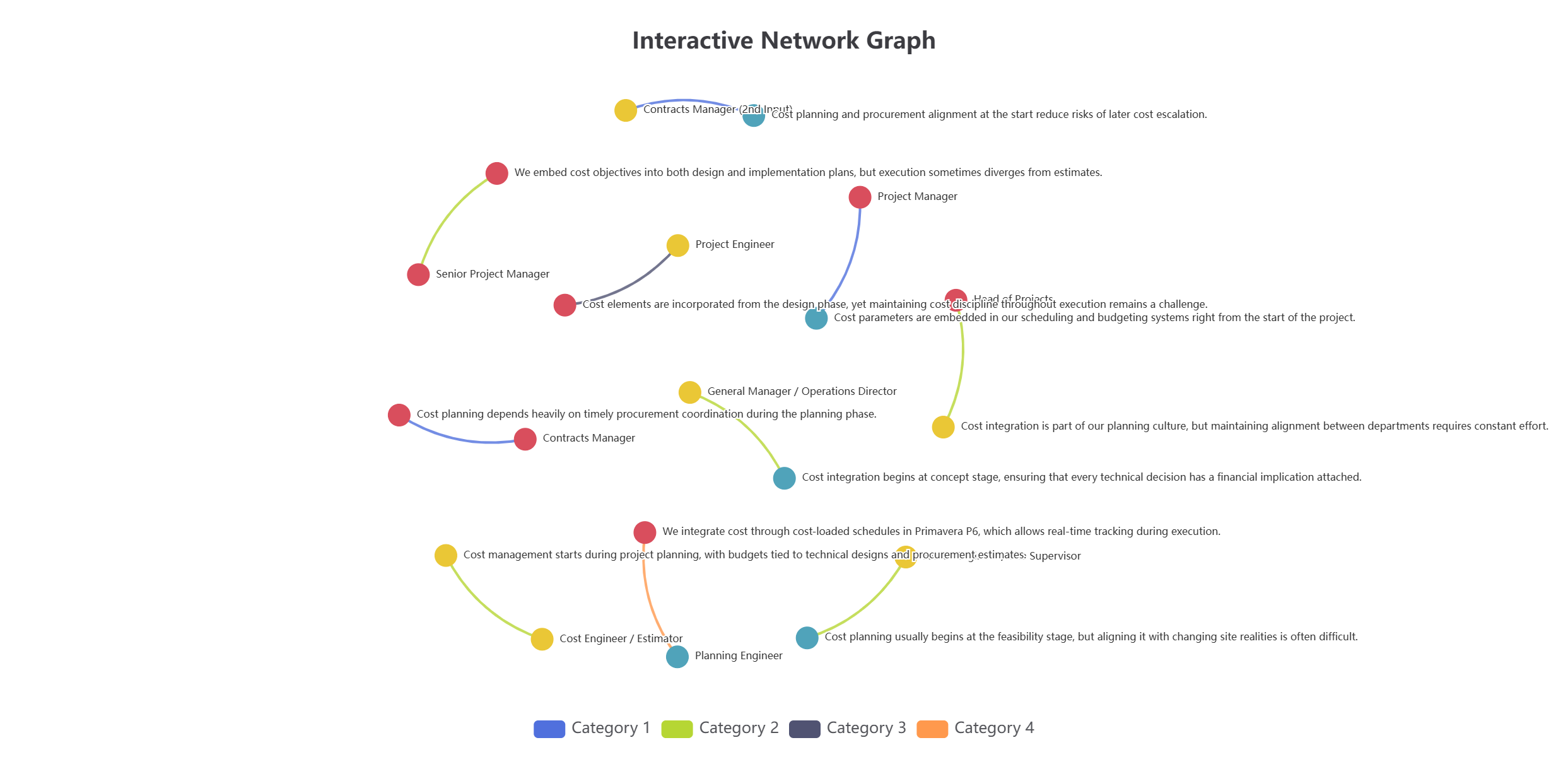
Advanced Data Visualization with Statistics
Tool Description
The Advanced Data Visualization with Statistics tool in FitzStatistics represents a comprehensive, multi-framework visualization engine that integrates D3.js, Chart.js, and Plotly capabilities into a unified desktop interface. This sophisticated tool is designed for complex statistical graphics requiring hierarchical, relational, and matrix-based representations of multivariate datasets. Users can import data from CSV and Excel files, with an intuitive tabbed control panel organizing functionality across Data, Chart Variants, Style, and Advanced sections. The tool specializes in three primary visualization categories: Sankey Diagrams (with 16 variants including classic, circular, arc, radial, tree, split flow, converging, network, layered, stepped, ribbon, stream, parallel, weighted, directional, and interactive), Matrix Diagrams (with 20 variants including heat map, correlation, adjacency, circular, triangular, bubble, color-coded, scaled, clustered, hierarchical, weighted, sparse, binary, gradient, pattern, network, flow, distance, similarity, and interactive), and Dendrograms (with 20 variants including classic tree, radial, circular, horizontal, cluster, phylogenetic, binary, multi-branch, collapsible, interactive, sunburst, icicle, treemap, nested, force, balloon, fan, cladogram, network, and hierarchical). The extensive styling options include node shape selection (rectangle, circle, diamond, pill), connection style customization (curved, straight, stepped, arced), comprehensive color management with theme switching, label rotation controls with individual label selection, margin adjustments, and animation controls.
Application and Analysis Type
This tool is designed for both quantitative and qualitative data analysis, with particular strength in visualizing complex relational structures, hierarchical relationships, and multivariate patterns. The Sankey diagram variants excel at displaying flow quantities between nodes, making them invaluable for energy audits, material flow analysis, budget allocations, migration patterns, and web traffic analysis where understanding the magnitude of flow between categories is essential. The matrix diagram variants provide comprehensive solutions for exploring relationships between variables, including correlation matrices for statistical analysis, adjacency matrices for network connectivity, distance matrices for clustering applications, and similarity matrices for pattern recognition in fields such as bioinformatics, social network analysis, and market research. The dendrogram variants offer powerful hierarchical visualization capabilities for phylogenetic trees in evolutionary biology, organizational charts in management, classification hierarchies in taxonomy, clustering results in machine learning, and family trees in genealogy. The inclusion of specialized variants like the collapsible tree enables interactive exploration of deep hierarchies, while force-directed trees provide organic layouts for complex nested relationships. The tool’s ability to handle frequency data, percentages, and show totals in legends makes it particularly valuable for statistical reporting where understanding both absolute and relative quantities is crucial.
Credibility and Validity of Methodology
The Advanced Data Visualization with Statistics tool employs rigorous statistical and computational methodologies validated through implementation in the D3.js library, which is widely recognized as the gold standard for data-driven document manipulation and visualization. The Sankey diagram implementation follows proper flow conservation principles where the sum of incoming flows equals the sum of outgoing flows for each node, ensuring mathematical consistency in flow representations. The matrix diagram variants implement statistically valid correlation calculations (Pearson, Spearman, and custom similarity measures), proper distance metrics (Euclidean, Manhattan, Jaccard), and clustering algorithms that maintain mathematical integrity. The dendrogram generation uses hierarchical clustering algorithms with appropriate linkage methods (single, complete, average, Ward) that preserve the topological relationships in the data. The color mapping system supports perceptually uniform color schemes (derived from d3-scale-chromatic) that ensure accurate data interpretation and accessibility. The tool’s implementation of frequency calculations and percentage conversions follows proper statistical aggregation methods, with options to calculate percentages based on selected variables, column variables, or total variables in the dataset. The label rotation system allows for precise typographic control while maintaining text readability and preventing overlap through individual label selection and adjustment. The force-directed layout algorithms used in network variants employ physics-based simulations with configurable parameters (repulsion, attraction, damping) that produce stable, interpretable layouts. The export functionality maintains vector graphics fidelity through SVG export, while raster exports preserve visual quality at specified resolutions. By leveraging the robust statistical foundations of D3.js and implementing mathematically sound algorithms for all visualization types, the Advanced Data Visualization with Statistics tool provides researchers with credible, valid, and publication-ready visualizations for complex statistical analyses.
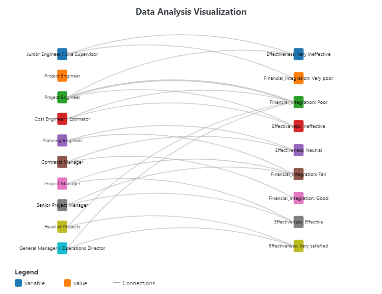
Advanced Qualitative Data Visualizer
Tool Description
The Advanced Qualitative Data Visualizer in FitzStatistics is a sophisticated, multi-paradigm visualization engine specifically designed for exploring and representing qualitative and categorical data relationships. As a desktop application tool, it transforms non-numerical data—such as participant responses, categorical attributes, textual labels, and nominal variables—into twenty distinct diagrammatic representations that reveal patterns, connections, and hierarchies within qualitative datasets. The tool features a comprehensive tabbed interface organizing functionality across Data Entry, Diagram Type Selection, Highlighting, Customization, and Export sections. Users can manually enter data through an editable table or import from CSV and Excel files, with support for dynamic row and column addition. The tool specializes in qualitative visualization types including Force-Directed Networks for relationship mapping, Hierarchical Trees for taxonomic classification, Chord Diagrams for bidirectional relationships, Arc Diagrams for connection patterns, Circle Packing for nested categories, Hive Plots for multi-dimensional attribute analysis, Treemaps for proportional categorical representation, Sunburst Charts for hierarchical proportions, Word Clouds for textual frequency analysis, Heatmaps for categorical intensity patterns, and Parallel Coordinates for multi-attribute comparison. Advanced features include node highlighting based on text containment or numeric thresholds, connection highlighting for specific relationships, individual node label positioning with nine directional options, adjustable label distances, and comprehensive color customization for rows and variables.
Application and Analysis Type
This tool is exclusively designed for qualitative data analysis, with specialized capabilities for handling nominal, ordinal, and categorical variables where numerical values are absent or secondary to the relationships between categories. The qualitative focus makes it invaluable for social science research where participant responses, demographic categories, and thematic codes need visualization; market research where customer segments, brand associations, and preference patterns are explored; content analysis where themes, categories, and their co-occurrences are mapped; anthropological studies where kinship relationships, cultural categories, and social structures are examined; linguistic research where word associations, semantic networks, and language patterns are analyzed; and educational research where learning outcomes, student categories, and curricular relationships are visualized. The twenty diagram types each serve distinct qualitative analytical purposes: force-directed networks reveal emergent clusters and communities within categorical data; chord diagrams display the strength and direction of relationships between categories; hierarchical trees and dendrograms show taxonomic classification and nested categorical structures; treemaps and sunburst charts display proportional relationships within hierarchical categorical data; word clouds provide immediate visual emphasis on frequently occurring terms; heatmaps reveal patterns of co-occurrence across categorical dimensions; and parallel coordinates enable comparison of multiple categorical attributes simultaneously. The node highlighting functionality, with options for text containment, exact matching, and numeric threshold comparisons, allows researchers to dynamically identify and emphasize categories meeting specific qualitative criteria.
Credibility and Validity of Methodology
The Advanced Qualitative Data Visualizer employs robust computational methodologies validated through implementation in the D3.js library, which is widely recognized as the industry standard for data-driven document manipulation and visualization. The force-directed network implementation uses physics-based simulations with configurable repulsion, attraction, and damping parameters to produce stable, interpretable layouts that accurately reflect relational structures in qualitative data. The hierarchical tree and dendrogram algorithms implement proper taxonomic classification methods with appropriate linkage criteria, ensuring that hierarchical relationships are represented accurately and consistently. The chord diagram implementation follows mathematically sound principles for representing bidirectional relationships, with proper matrix construction and ribbon generation that preserves the integrity of categorical connections. The node highlighting system uses efficient string matching algorithms and numerical comparison functions that accurately identify categories meeting specified criteria, with support for partial matching (“contains”), exact matching (“equals”), and threshold comparisons (“greater than”/”less than”) that accommodate both textual and numeric categorical values. The label positioning system allows for individual node label adjustment with nine directional options and configurable distances, enabling researchers to resolve label overlaps and improve readability without compromising data integrity. The color customization system provides per-row and per-variable color control, allowing for consistent categorical encoding across multiple visualizations. The project save/load functionality preserves all data, color settings, and highlighting rules in structured JSON format, ensuring reproducibility and enabling collaborative analysis. The export system supports multiple formats (PNG, JPEG, SVG) at varying resolutions, including high-quality 4K exports suitable for publication and presentation. By leveraging the proven computational foundations of D3.js and implementing mathematically sound algorithms for all qualitative visualization types, the Advanced Qualitative Data Visualizer provides researchers with credible, valid, and publication-ready tools for exploring and communicating complex categorical relationships.
Quantitative Data Analysis Tool
Tool Description
The Quantitative Data Analysis Tool in FitzStatistics is a comprehensive, multi-framework analytical engine designed specifically for numerical data exploration, statistical modeling, and advanced econometric analysis. As a desktop application tool, it provides researchers with over 50 specialized visualization and analysis types organized into ten analytical categories: Heatmaps (basic, annotated, 3D surface, contour, correlation, calendar, clustered, geographical, animated, 4D, and polar heatmaps), Density Charts (KDE, 2D density, density contour, violin, ridgeline, hexbin, heat density, 3D density surface, animated density evolution, and multivariate density), Statistical Charts (histogram, box plot, violin, bar, scatter, pie, line, area, radar, candlestick, funnel, waterfall, error bars, Pareto, and dot plots), Categorical Charts (grouped bar, stacked bar, donut, treemap, sunburst, polar bar, Nightingale rose, parallel categories, and bullet charts), Temporal Charts (time series with ranges, moving average, calendar view, Gantt, stream graph, time heatmap, connected scatter, slope chart, step chart, range area, and OHLC charts), Relationship Charts (scatter, bubble, connected scatter, correlation matrix, parallel coordinates, network, chord, Sankey, dendrogram, alluvial, arc, and force-directed graphs), Sensitivity Analysis (correlation heatmap, tornado plot, spider/radar plot, partial dependence plot, scatter matrix, coefficient plot, ANCOVA plot, variable importance plot, sensitivity curve, and response surface plot), Trend Analysis (decomposition plot, linear trend, exponential trend, moving average trend, LOESS smoothing, trend comparison, seasonal decomposition, Hodrick-Prescott filter, trend forecast, and multi-variable trend analysis), Impulse Response (simple, orthogonalized, cumulative, forecast error variance decomposition, multi-variable, shock propagation, feedback analysis, autoregressive response, structural response, and cross-impact response), Elasticity Analysis (price elasticity, cross-elasticity, income elasticity, elasticity over time, elasticity distribution, elasticity heatmap, elasticity comparison, elasticity confidence intervals, elasticity vs quantity, and multi-factor elasticity analysis), 3D Visualizations (3D scatter, surface, line, mesh, bar, bubble, contour, heatmap surface, ribbon, vector field, waterfall, and stream tube), and Animated Charts (animated scatter, bar, line, heatmap, bubble, choropleth, motion chart, transition graph, animated network, streamgraph, radar, and racing bar chart). The tool features an intuitive dual-panel interface with drag-and-drop file import, automatic data preview with scrollable tables, qualitative-to-frequency conversion, and comprehensive variable selection with multi-checkbox functionality.
Application and Analysis Type
This tool is exclusively designed for quantitative data analysis, with specialized capabilities for handling numerical, time-series, and multivariate datasets where statistical inference, econometric modeling, and mathematical relationships are the primary focus. The quantitative orientation makes it indispensable for econometric research where price elasticity, demand forecasting, and impulse response functions are analyzed; financial analysis where candlestick charts, volatility modeling, and risk assessment are performed; experimental sciences where dose-response curves, sensitivity analysis, and multivariate relationships are examined; engineering applications where signal processing, trend analysis, and system dynamics are studied; business analytics where sales forecasting, market sensitivity, and price optimization are conducted; and epidemiological research where disease spread modeling, intervention analysis, and temporal trends are investigated. The ten analytical categories each serve distinct quantitative purposes: heatmaps reveal intensity patterns across two dimensions; density charts estimate probability distributions and data concentration; statistical charts provide descriptive and inferential statistics; categorical charts display frequencies and proportions; temporal charts analyze time-dependent patterns and forecasting; relationship charts explore correlations and multivariate dependencies; sensitivity analysis quantifies how output variables respond to input variations; trend analysis decomposes and forecasts time series components; impulse response traces shock propagation through dynamic systems; elasticity analysis measures responsiveness between economic variables; 3D visualizations enable multi-dimensional data exploration; and animated charts reveal temporal dynamics and evolution patterns. The advanced analytical modules implement sophisticated econometric techniques including multiple linear regression, time series decomposition, moving average calculations, confidence interval estimation, correlation matrices, impulse response functions, and elasticity estimation using log-log models.
Credibility and Validity of Methodology
The Quantitative Data Analysis Tool employs rigorous statistical and econometric methodologies validated through implementation in the Plotly.js and D3.js libraries, which are widely recognized for their scientific visualization accuracy and computational reliability. The correlation analysis implements mathematically correct Pearson correlation coefficients with proper handling of missing data and numerical stability considerations. The regression analysis uses multiple linear regression via normal equations with ridge regularization to ensure numerical stability even with ill-conditioned matrices. The time series decomposition implements classical additive and multiplicative decomposition with configurable seasonality periods and trend estimation using moving averages. The moving average calculations support configurable window sizes with centered and trailing options, and confidence interval estimation uses t-distribution approximations with appropriate degrees of freedom. The impulse response functions implement both simple and orthogonalized variants, accounting for contemporaneous correlations through Cholesky decomposition. The elasticity analysis uses log-log transformation for constant elasticity estimation, with multi-factor elasticity implementing multiple regression on log-transformed variables. The variable importance calculations use R-squared contributions and standardized coefficients to rank predictor influence. The sensitivity analysis implements tornado plots showing variable impact ranges, spider plots for multi-dimensional sensitivity visualization, and response surface methodology for two-factor interaction analysis. The trend forecasting extends identified trends with prediction intervals that properly account for increasing uncertainty with forecast horizon. The heatmap implementations use appropriate color scaling and interpolation methods to accurately represent data density and intensity. The 3D visualizations employ proper perspective rendering, lighting models, and camera controls for accurate spatial perception. All statistical calculations are performed using the simple-statistics library, which provides validated implementations of descriptive statistics, linear regression, correlation, and probability distributions. The tool’s export functionality preserves analytical integrity through high-resolution image generation with configurable scale factors and format options. By implementing mathematically sound statistical algorithms and leveraging validated computational libraries, the Quantitative Data Analysis Tool provides researchers with credible, reproducible, and publication-ready analytical results for rigorous quantitative research.
FitzSet Theory Data Analyzer
Tool Description
The FitzSet Theory Data Analyzer in FitzStatistics is a specialized mathematical visualization engine dedicated to set-theoretic analysis, Venn diagram generation, and relational data exploration based on categorical membership and property relationships. As a desktop application tool, it transforms tabular datasets into formal set representations where rows become variables (sets) and columns become properties (elements), enabling sophisticated set operations including union (∪), intersection (∩), difference (- or ), symmetric difference (△ or ⊕), complement (‘), subset relations (⊆, ⊇, ⊂, ⊃), and element membership testing (∈, ∉). The tool features a dual-interface architecture with both a traditional set analysis panel and an innovative Set Theory Command Interface that accepts complex mathematical expressions with parentheses, mixed operators, and intelligent space handling for multi-word variable names (e.g., “Product Category” ∩ “Customer Type”). Users can import data from CSV and Excel files, with comprehensive data preview and variable selection capabilities. The command interface includes a specialized set theory keyboard with mathematical symbols, real-time expression evaluation, command history tracking, and result display with detailed element listings. The tool supports 14 alternative chart types beyond classic Venn diagrams, organized into four categories: Network Charts (force-directed, hierarchical, circular, radial, multi-layer networks), Tree Charts (vertical, horizontal, radial, circular dendrograms), Connection Charts (linear arc, curved arc, classic chord diagrams), and Hierarchy Charts (standard tree, cluster tree). The Venn diagram engine supports 2-3 set visualizations with 20 distinct styling options including classic circles, ovals, hexagons, diamonds, stars, triangles, pentagons, octagons, hearts, 3D effects, minimalism, gradients, neon, cyberpunk, retro, watercolor, hand-drawn, and glass morphism effects. Comprehensive color customization allows individual set coloring, unique element colors, shared element colors, and real-time style updates. Export functionality supports PNG, JPEG, SVG formats, and high-fidelity screenshots via html2canvas.
Application and Analysis Type
This tool is exclusively designed for qualitative and categorical data analysis through the formal lens of set theory, where relationships between entities are defined by membership in categories rather than numerical quantities. The set-theoretic approach makes it invaluable for library science and information retrieval where document classification, subject headings, and term co-occurrence are analyzed; market research where customer segments, product attributes, and brand associations are explored through membership in overlapping categories; survey analysis where respondent characteristics, response patterns, and demographic intersections are examined; taxonomic studies where specimen classifications, trait distributions, and hierarchical categorizations are visualized; educational research where student competencies, learning objectives, and skill intersections are mapped; and policy analysis where stakeholder groups, policy impacts, and jurisdictional overlaps are studied. The fourteen alternative chart types provide specialized analytical perspectives: force-directed networks reveal emergent clusters and community structures in set membership data; hierarchical trees display taxonomic classifications and nested categorical relationships; chord diagrams show bidirectional relationships and flow intensities between categories; arc diagrams highlight connection patterns in linearly arranged sets; and dendrograms illustrate clustering hierarchies and similarity relationships. The command interface enables complex set-theoretic queries such as “(Product Category ∩ Customer Type) ∪ Sales Region – (Discount Group ∩ Premium Customers)”, allowing researchers to formulate precise analytical questions about their categorical data. The intelligent space handling automatically recognizes multi-word variable names, with optional quote wrapping for explicit boundary definition, making the tool accessible for real-world datasets with descriptive column headers.
Credibility and Validity of Methodology
The FitzSet Theory Data Analyzer employs rigorous mathematical set theory principles validated through formal logical operations and implemented in robust JavaScript libraries. The set operation parser uses a tokenization and infix-to-postfix conversion algorithm with proper operator precedence (complement having highest precedence, followed by intersection, then union and difference), ensuring mathematically correct evaluation of complex expressions with parentheses. The complement operation correctly handles universal set definition, where the complement of a set A is defined as all elements in the universal set (derived from selected properties) that are not in A. The symmetric difference operation (△ and ⊕) properly computes elements in either set but not both, following the formal definition A △ B = (A \ B) ∪ (B \ A). The element-property mapping maintains bidirectional relationships, allowing each element to be traced back to its originating property for contextual tooltips and analytical insights. The Venn diagram positioning algorithm uses geometric circle intersection calculations to accurately represent set relationships, with element placement attempting to position elements within appropriate regions (unique, pairwise intersection, triple intersection) through iterative point-in-circle testing. The 14 alternative chart implementations leverage D3.js force simulations and hierarchical layouts that have been validated for accuracy in representing relational data. The force-directed network uses proper physics-based simulation with configurable repulsion, attraction, and damping parameters, ensuring stable and interpretable layouts. The dendrogram implementations use correct hierarchical clustering algorithms with appropriate linkage criteria. The chord diagram properly constructs adjacency matrices and uses mathematically sound ribbon generation for representing bidirectional flows. The text wrapping algorithm approximates character widths for SVG rendering, ensuring long labels remain readable without overlapping. The export functionality preserves mathematical relationships and visual accuracy through high-fidelity SVG generation and raster conversion. By implementing formal set theory operations and leveraging validated visualization libraries, the FitzSet Theory Data Analyzer provides researchers with credible, mathematically sound tools for exploring categorical relationships and set membership patterns.
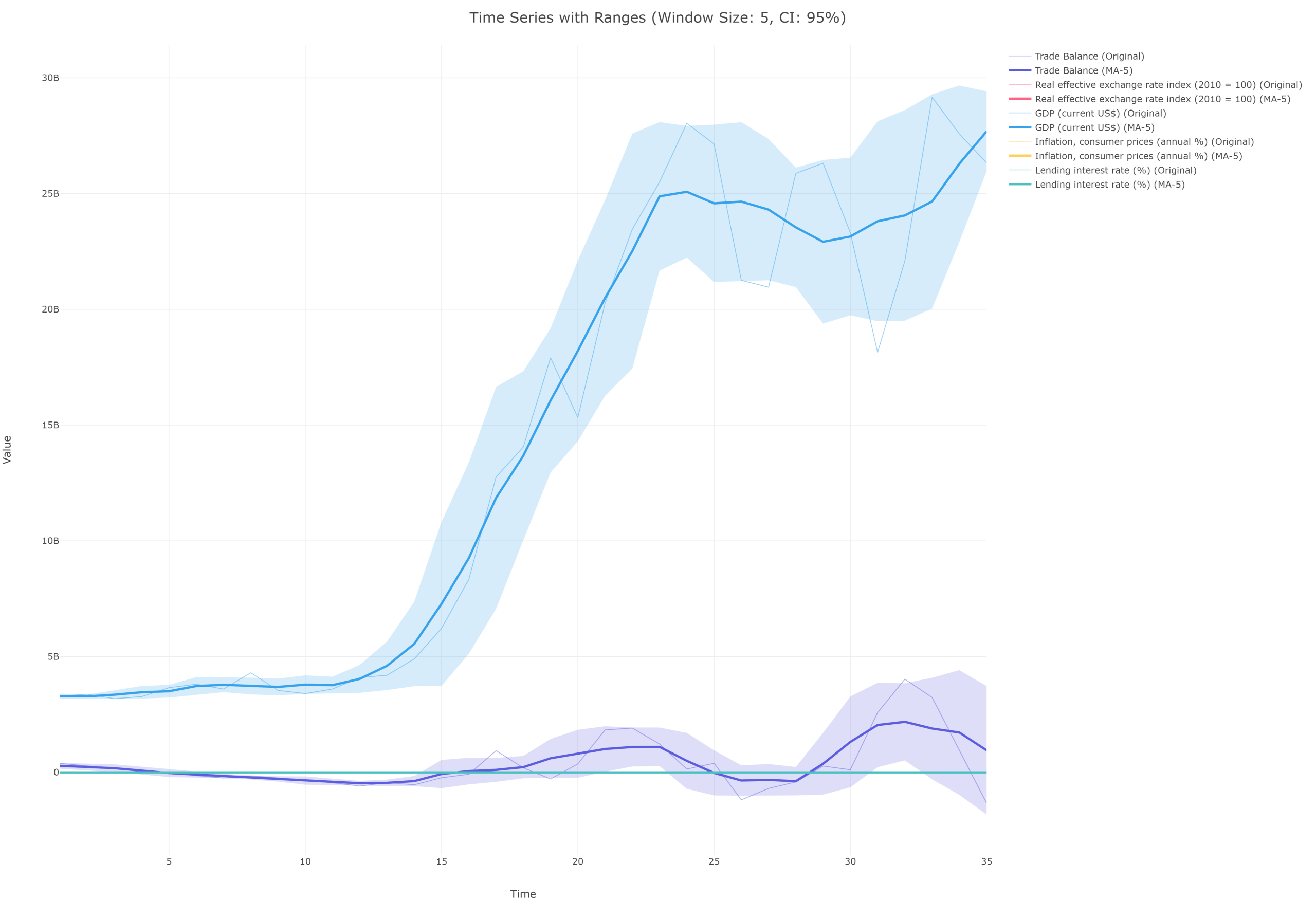
Time Series Component Analysis Tool
Tool Description
The Time Series Component Analysis Tool in FitzStatistics is a comprehensive, multi-framework analytical engine specifically designed for temporal data decomposition, regression modeling, and comparative time series analysis. As a desktop application tool, it provides researchers with sophisticated capabilities for dissecting time-dependent data into its constituent components—trend, seasonal, and residual—while supporting advanced econometric techniques including forecasting, sensitivity analysis, elasticity estimation, residual diagnostics, autocorrelation analysis, and variable transformations. The tool features a tabbed interface organizing functionality across three analytical domains: Time Series Decomposition (with configurable component display options and advanced seasonal transformations including Fourier transform, wavelet decomposition, ARIMA seasonal, STL decomposition, X-13 ARIMA-SEATS, Hodrick-Prescott filter, LOESS smoothing, Butterworth filter, Kalman filter, and empirical mode decomposition), Regression Analysis (supporting multiple independent variables with forecasting, sensitivity analysis, elasticity calculations, residual diagnostics, autocorrelation analysis, and variable transformations), and Comparative Analysis (enabling dual-axis visualization with background components overlaid against comparison variables, annotation management with period shading and vertical line markers, and dynamic variable management). The tool imports data from CSV and Excel files with automatic time variable detection and configurable time range filtering. Advanced statistical features include Ljung-Box tests, ARCH effect plots, partial autocorrelation functions (PACF), Durbin-Watson statistics, Jarque-Bera tests, Anderson-Darling tests, Shapiro-Wilk tests, CUSUM plots, recursive residuals, and studentized residuals. The annotation system supports multiple period ranges per annotation with customizable colors, transparency levels, and vertical line conditions (above, below, equal to threshold) with configurable line styles.
Application and Analysis Type
This tool is exclusively designed for quantitative time series analysis, with specialized capabilities for handling temporal data where observations are ordered chronologically and relationships between variables evolve over time. The time series focus makes it indispensable for econometric forecasting where GDP growth, inflation rates, and employment trends are analyzed; financial analysis where stock prices, trading volumes, and volatility patterns are examined; environmental monitoring where temperature records, precipitation data, and pollution levels are studied; epidemiological research where disease incidence, mortality rates, and intervention effects are evaluated; business analytics where sales figures, customer traffic, and inventory levels are forecasted; and operational research where production volumes, equipment utilization, and quality metrics are monitored. The three analytical tabs serve distinct purposes: time series decomposition reveals underlying patterns by separating data into trend (long-term progression), seasonal (regular cyclical fluctuations), and residual (irregular variations) components, with 15 advanced seasonal transformation methods enabling sophisticated pattern extraction; regression analysis enables multivariate modeling with comprehensive diagnostics including elasticity measurements that quantify responsiveness between variables, sensitivity analysis that examines how output variables respond to input variations, and residual diagnostics that validate model assumptions through normality tests (Jarque-Bera, Shapiro-Wilk, Anderson-Darling), autocorrelation tests (Durbin-Watson, Ljung-Box, ACF/PACF), and stability tests (CUSUM, recursive residuals); comparative analysis with dual Y-axes allows simultaneous visualization of background components (original, trend, seasonal, residual) against comparison variables, with each background variable independently transformable through 20+ options including polynomial trends, exponential trends, spline smoothing, and various filters. The annotation system enables researchers to highlight specific time periods (e.g., economic recessions, policy interventions, seasonal events) and mark threshold crossings (e.g., price ceilings, quality control limits), with support for multiple period ranges per annotation and customizable visual styling.
Credibility and Validity of Methodology
The Time Series Component Analysis Tool employs rigorous statistical and econometric methodologies validated through implementation in established JavaScript libraries including Chart.js, D3.js, simple-statistics, and regression.js. The time series decomposition implements classical additive decomposition with moving average trend estimation and seasonal component extraction using period-based averaging, with the residual derived as the remainder after trend and seasonal removal. The 15 advanced seasonal transformation methods implement mathematically sound algorithms: Fourier transform approximates seasonal patterns through frequency domain analysis; wavelet decomposition uses Haar wavelets for multi-resolution analysis; ARIMA seasonal applies seasonal differencing with exponential smoothing; STL decomposition uses LOESS for robust seasonal-trend separation; X-13 ARIMA-SEATS incorporates trading day and calendar adjustments; Hodrick-Prescott filter minimizes a quadratic penalty for trend smoothness; LOESS smoothing uses locally weighted regression; Butterworth filter implements recursive low-pass filtering; Kalman filter provides optimal state estimation; and empirical mode decomposition extracts intrinsic mode functions through iterative sifting. The regression module uses ordinary least squares with proper matrix operations for coefficient estimation, calculating R-squared, adjusted R-squared, and standard errors for statistical inference. The elasticity analysis computes point elasticities at means using the formula ε = β × (X̄/Ȳ), providing economically meaningful measures of responsiveness. The residual diagnostics implement validated statistical tests: Ljung-Box test for autocorrelation (Q-statistic with chi-square distribution), ARCH effect test for conditional heteroskedasticity, Jarque-Bera test for normality (using skewness and kurtosis), Shapiro-Wilk test for small-sample normality (using order statistics), CUSUM test for parameter stability (cumulative sum of recursive residuals), and Durbin-Watson test for first-order autocorrelation (d-statistic with bounds). The autocorrelation and partial autocorrelation functions use Yule-Walker equations for accurate lagged correlation estimation. The transformation functions for variable transformations implement mathematically correct operations: log transformations for variance stabilization, differencing for stationarity, standardization for scale normalization, and Hodrick-Prescott filtering with configurable smoothing parameter (λ=1600 for quarterly data). The dual-axis comparative visualization maintains proper scaling relationships between left and right Y-axes, ensuring that background components and comparison variables are visually comparable without distortion. By implementing validated statistical algorithms and leveraging established numerical libraries, the Time Series Component Analysis Tool provides researchers with credible, reproducible, and publication-ready analytical results for rigorous temporal data analysis.
Access to the software
If you wish to have access to our statistical software program, contact us on +260-972412315 or send us an email on any of the following emails:
resgroup@research-expert-solutions.com
fitzgerald.mcdonald.witika@gmail.com