Research Expert Solutions Launches 15 Advanced Statistical Software Programs for Universities
Research Expert Solutions (RES) is proud to announce the official release of 15 groundbreaking statistical software programs designed to transform how universities conduct data analysis, research, and academic instruction. Developed by Fitzgerald Witika, Economist and Chief Executive Officer of Research Expert Solutions, this suite of desktop applications represents a major step forward in making high-level data analytics accessible, affordable, and fully optimized for academic environments.
For years, universities have faced challenges in accessing advanced analytical tools due to the high costs and fragmented nature of software licensing. This new initiative from RES offers an innovative solution — allowing universities to subscribe to all 15 statistical software programs as a single bundle at a fraction of the cost of individual subscriptions. Through this institutional model, lecturers and students can seamlessly access powerful offline analytical tools across research, teaching, and coursework without relying on external cloud systems or expensive international licenses.
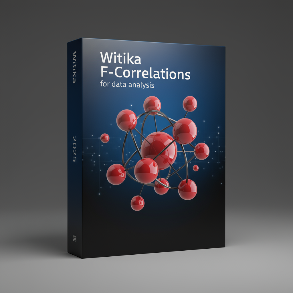
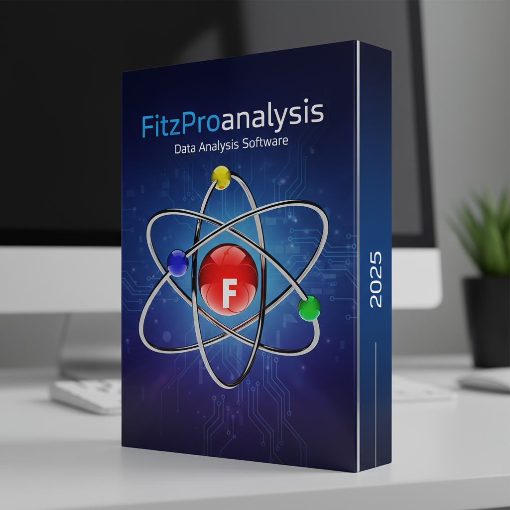
The 15 software programs were developed to cover a comprehensive range of analytical needs. Witika F-Correlations delivers deep correlation analysis with over 35 visualization types, while FitzStatistics integrates qualitative and quantitative analytics into one unified, no-code environment. FitzProanalysis combines econometric, forecasting, and machine learning capabilities with models such as ARIMA, VAR/VECM, and GARCH, making it an ideal companion for economics and business research. For students of game theory and behavioral economics, Fitzeconomic Games introduces an interactive, no-code platform for modeling and analyzing strategic decision-making scenarios.
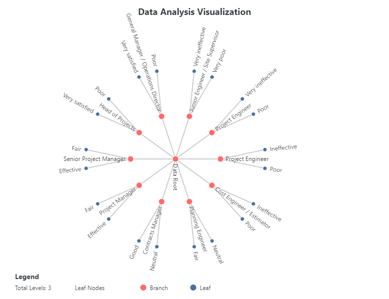
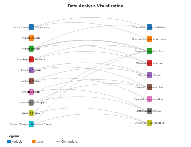
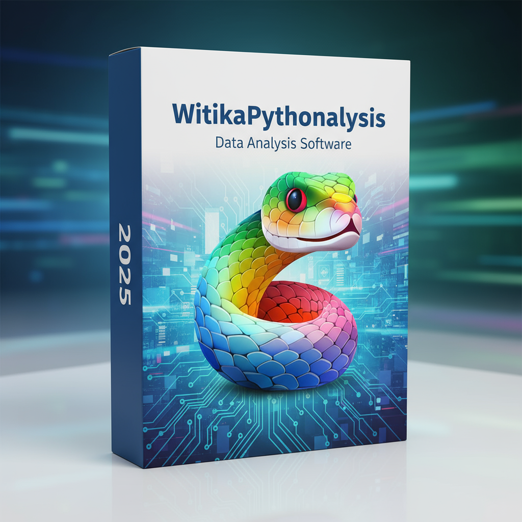
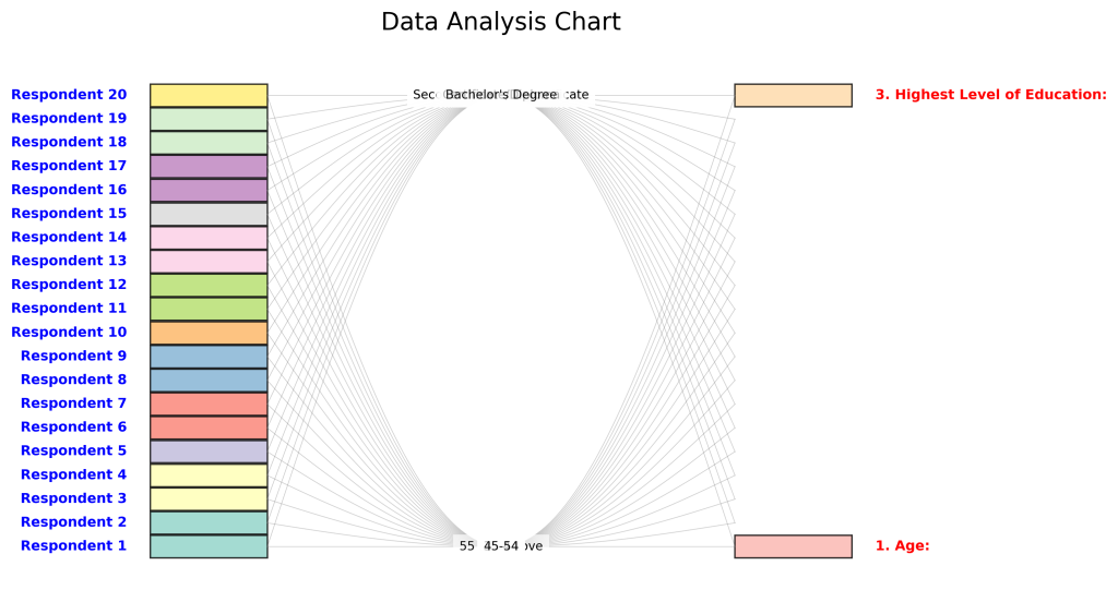
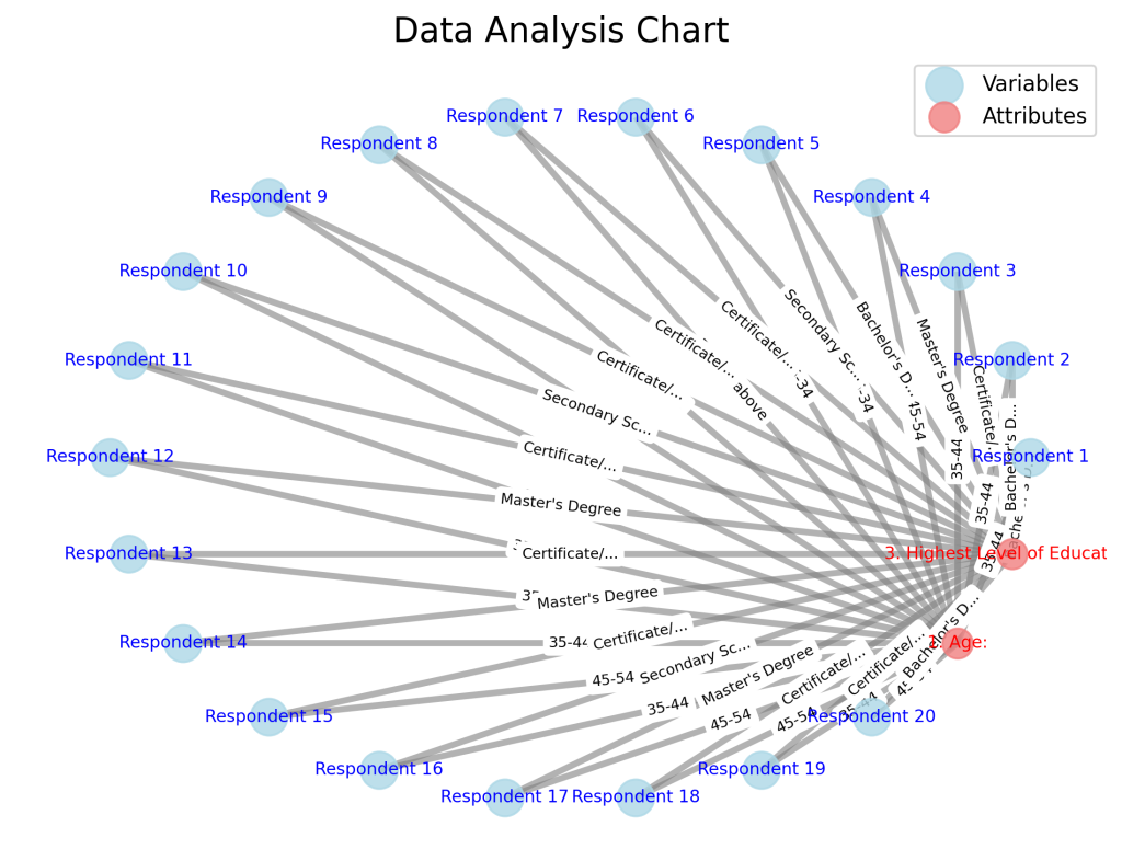
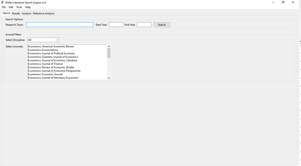
Other highlights include WitikaPythonalysis, a powerful visualization-first studio for categorical and mixed data, and the Witika Literature Search Engine (WLSE), which revolutionizes how researchers conduct systematic literature reviews and visualize bibliometric data. In the field of artificial intelligence and predictive modeling, Witika Machine Learning offers a point-and-click interface for building, evaluating, and interpreting models with ease.
The bundle also features several specialized analytical tools under the WitikaStats family — including Advanced Visualization & Storytelling, Time Series Analysis Suite, Scatter Matrix, Machine Learning Version, Correlation Ellipse Plotter, Contour Analysis, Stationarity Diagnostics, and the Advanced Correlation & Pair Plot Specialist. Each application is designed to produce publication-ready outputs, high-resolution visuals, and reproducible project files — empowering researchers, lecturers, and students to conduct data analysis with greater precision and efficiency.
What sets these software programs apart is their offline usability and built-in licensing security. Each installation is authorized through secure hardware binding, ensuring that the applications remain exclusive to licensed university computers and registered users. This eliminates unauthorized sharing while allowing universities to maintain full control over usage and compliance.
By subscribing to this bundle, universities not only gain access to state-of-the-art analytical software but also open doors for capacity building and research excellence. Lecturers can use the tools to produce publishable research with modern statistical rigor, while students benefit from hands-on exposure to advanced methods that enhance their dissertations and employability in data-driven industries.
The institutional subscription model allows a university to provide full access to all 15 programs for its students and staff at a single monthly fee — offering a sustainable, cost-effective alternative to traditional software licensing. Universities may optionally integrate a modest technology access fee to recover costs or generate additional revenue while enhancing the digital learning experience.
Through this initiative, Research Expert Solutions continues to fulfill its mission of empowering Africa’s academic community with locally developed, world-class analytical tools.
DETAILED INFORMATION ABOUT THE DATA ANALYSIS SOFTWARE PROGRAMS
No. | Software | Function |
1 | Witika F-Correlations | Deep correlation analysis with 35+ visualizations, Pearson/Spearman/Kendall, partial correlations, inference, ML features, reproducible projects. |
2 | FitzStatistics | Unified qual, quant, and mixed methods analytics; qualitative visualizers, time series, contour analysis; advanced visual discovery without coding. |
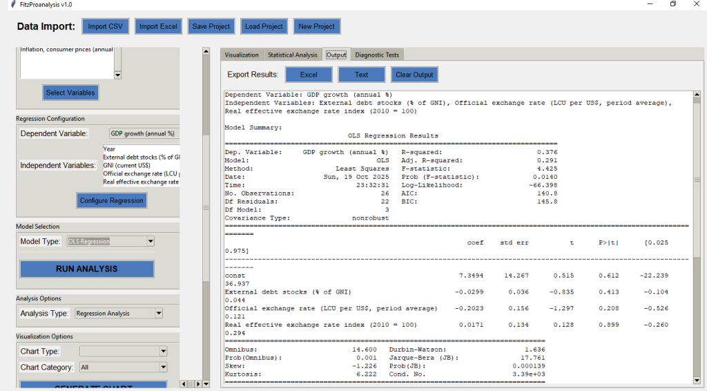
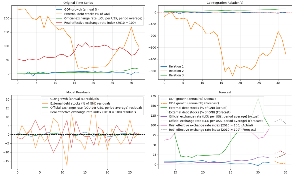
3 | FitzProanalysis | Forecasting, econometrics & ML GUI; ARIMA, VAR/VECM, GARCH, cointegration, diagnostics, 80+ charts, reproducible projects. |
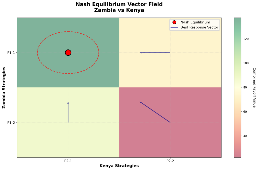
4 | Fitzeconomic Games | No-code environment to build/analyze multiplayer games; strategies, Nash equilibria, payoff matrices, game trees, policy simulations. |
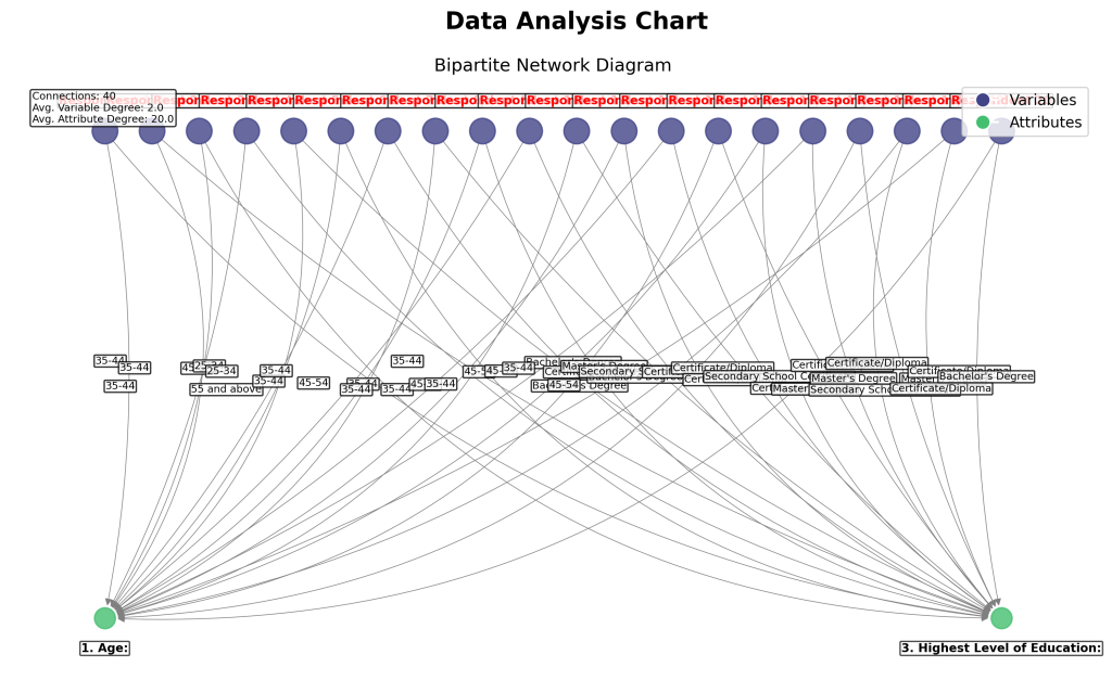
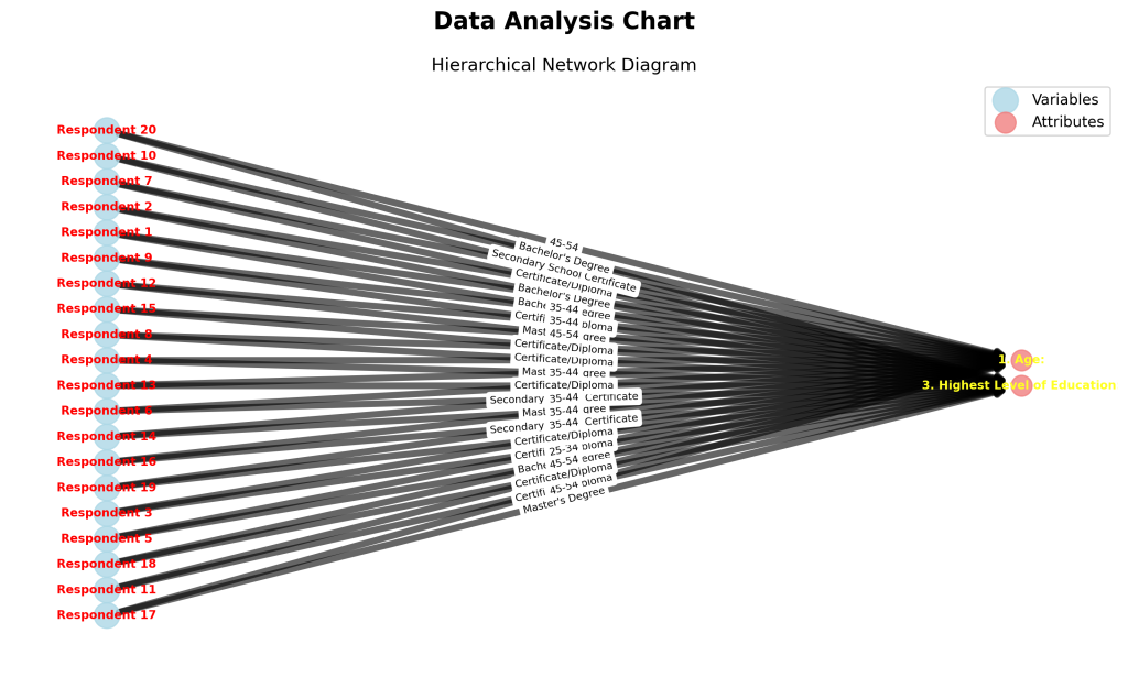
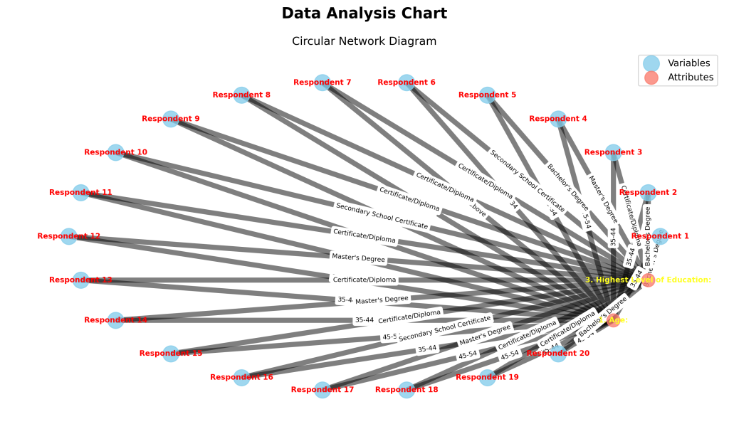
5 | WitikaPythonalysis | Visualization-first studio for categorical/qualitative/mixed data; 70+ visuals across networks, hierarchies, clustering, and sequences. |
6 | Witika Literature Search Engine (WLSE) | End-to-end literature tool; searches, screens, annotates, visualizes bibliometrics, timelines, and research flows. |
7 | Witika Machine Learning | Point-and-click ML pipeline builder; preprocessing, model training, diagnostics, explainability (ROC, SHAP, PDP/ICE). |
8 | WitikaStats — Advanced Visualization, Analytics & Storytelling | EDA and storytelling studio; cleans/profiles data, multivariate/spatiotemporal charts, exportable reports. |
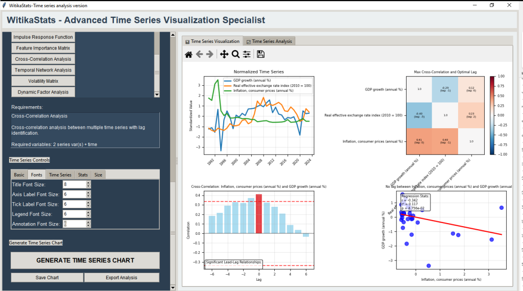
9 | WitikaStats — Time Series Analysis Suite | Specialized time series tool; decomposition, ARIMA/Holt-Winters, cross-correlation, clustering, reproducible exports. |
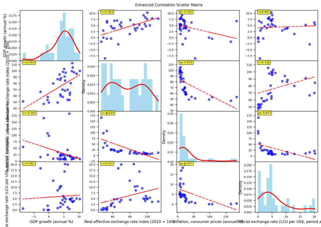
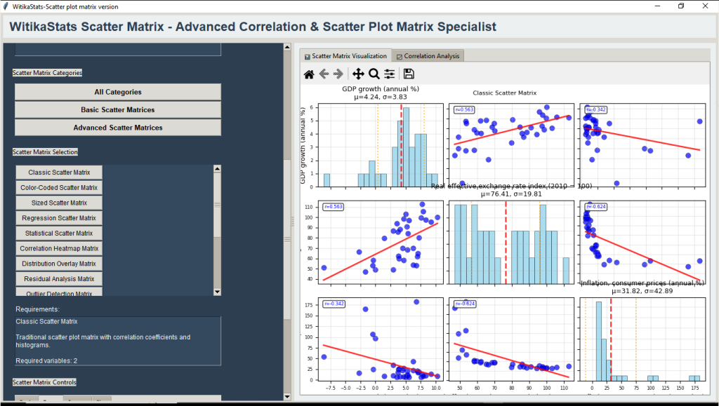
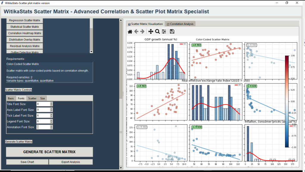
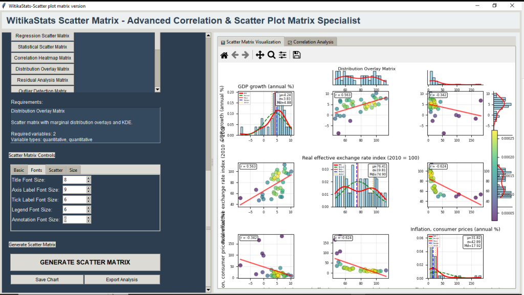
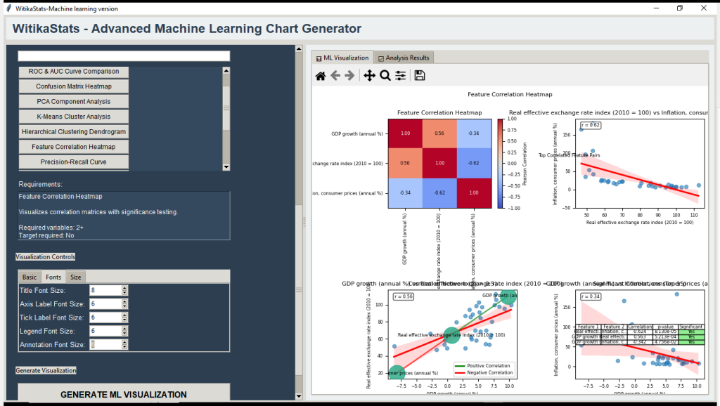
10 | WitikaStats Scatter Matrix | 20 enhanced scatter/correlation matrices with ellipses, PCA overlays, rolling correlations, density projections. |
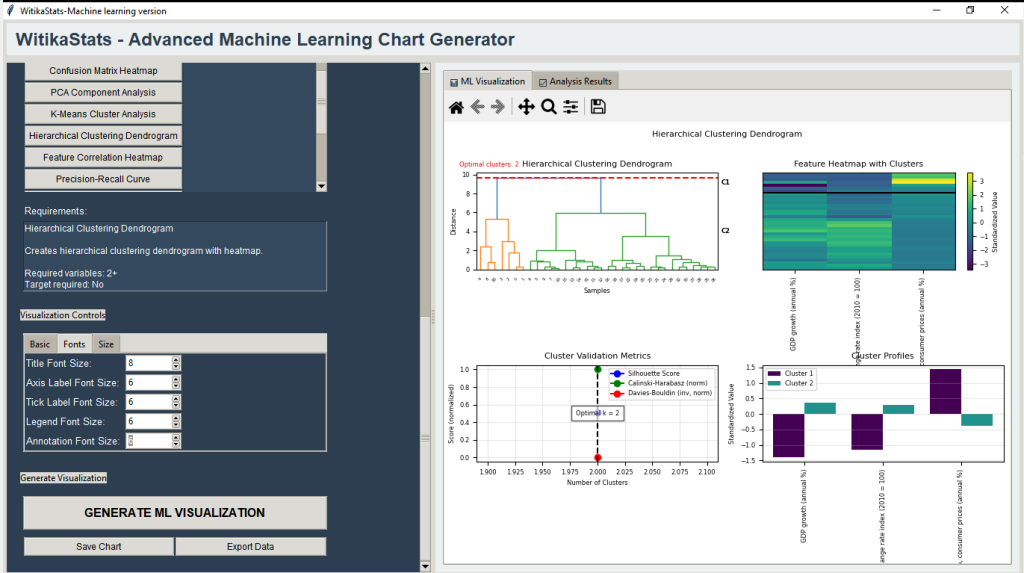
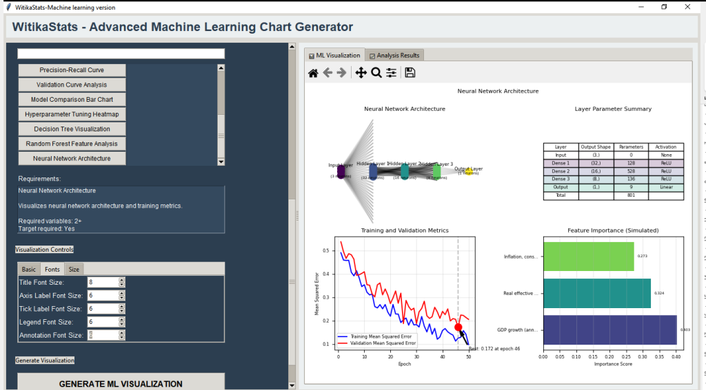
11 | WitikaStats Machine Learning Version | Visualization-centric ML diagnostics studio; supervised/unsupervised models, PCA/t-SNE/UMAP, anomaly detection, clustering. |
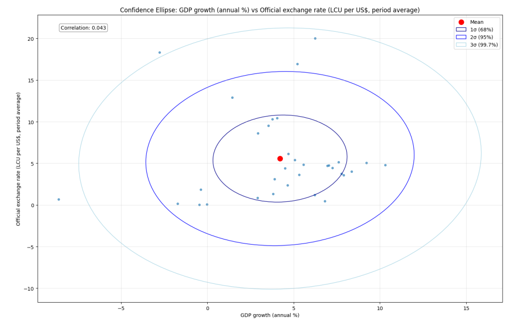
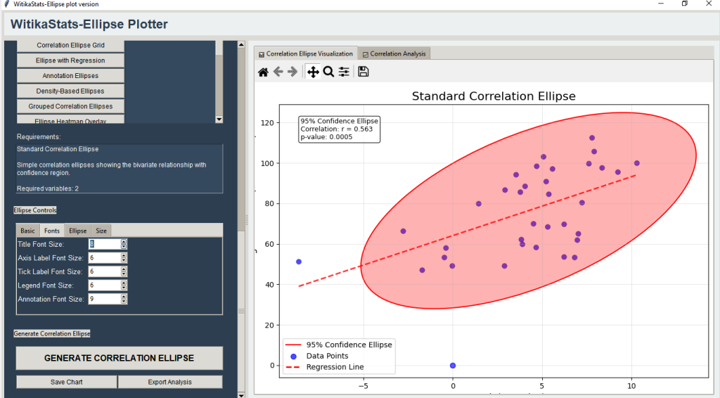
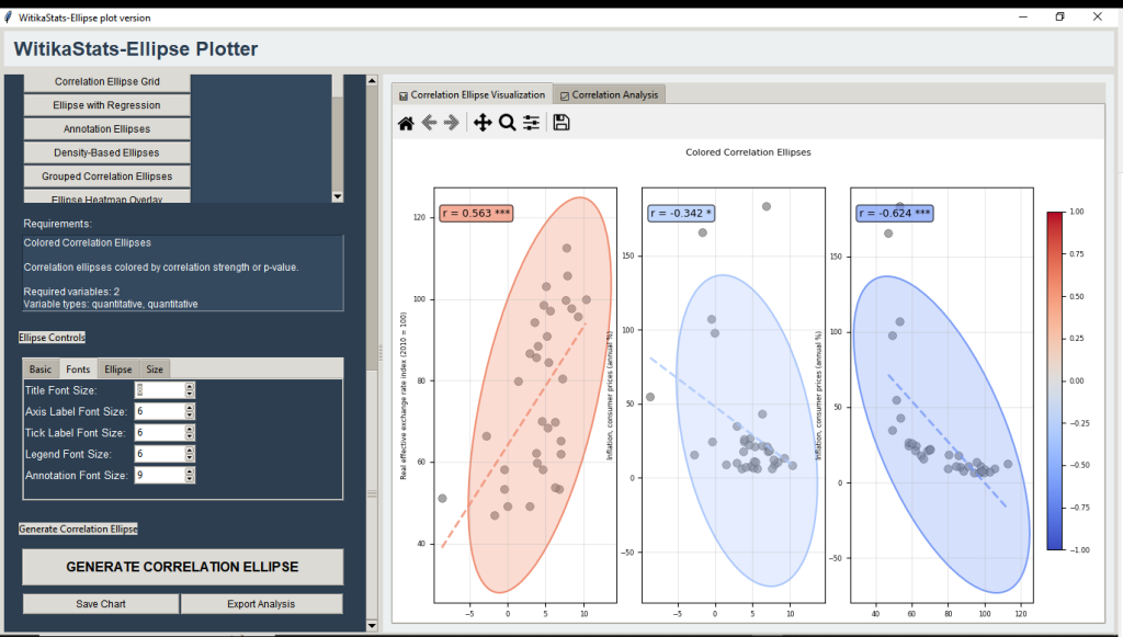
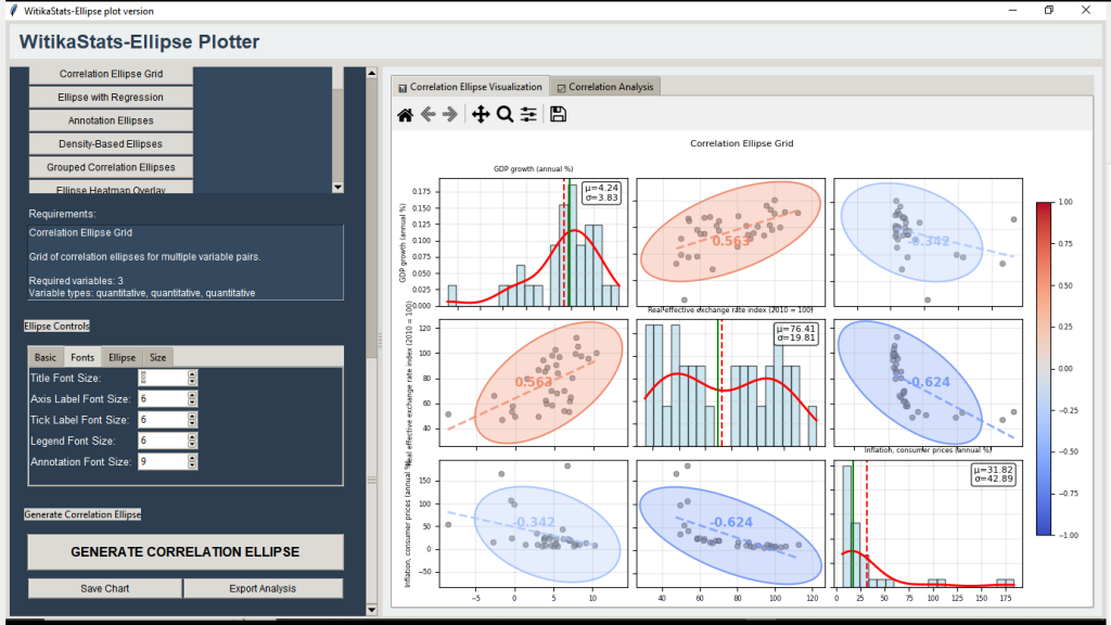
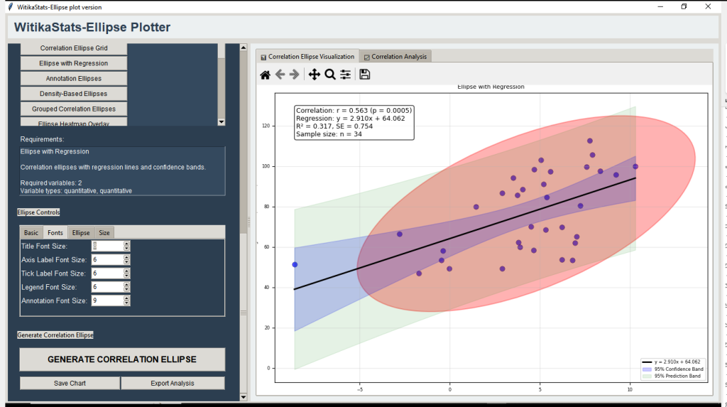
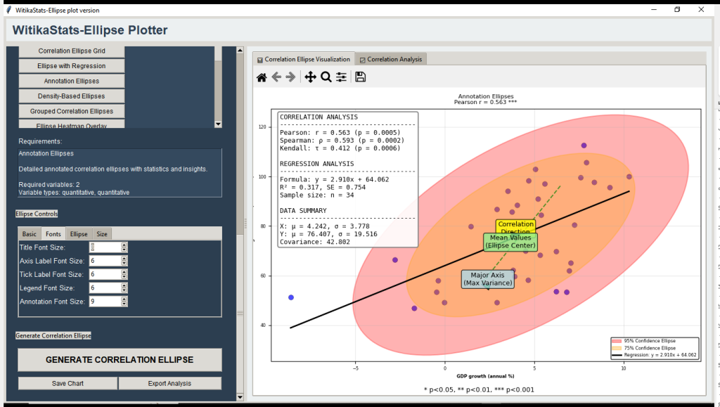
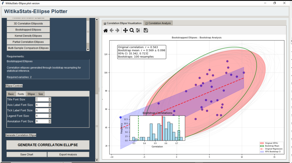
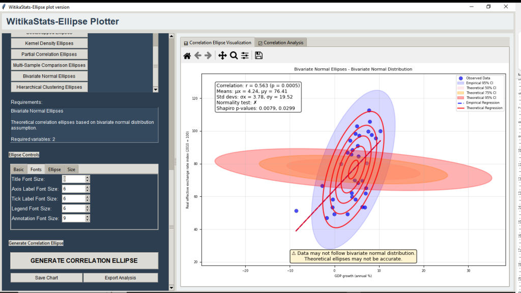
12 | WitikaStats Correlation Ellipse Plotter | Confidence ellipse/ellipsoid analysis; regression bands, bootstrap inference, Fisher’s z, 3D ellipses. |
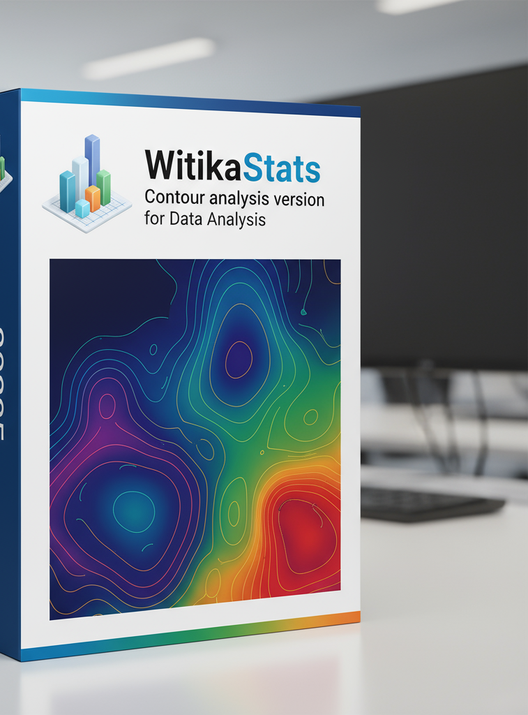
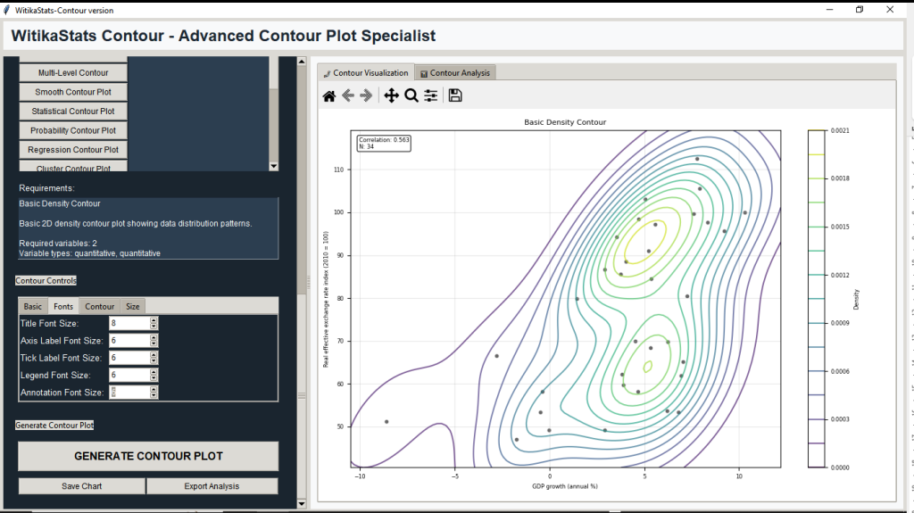
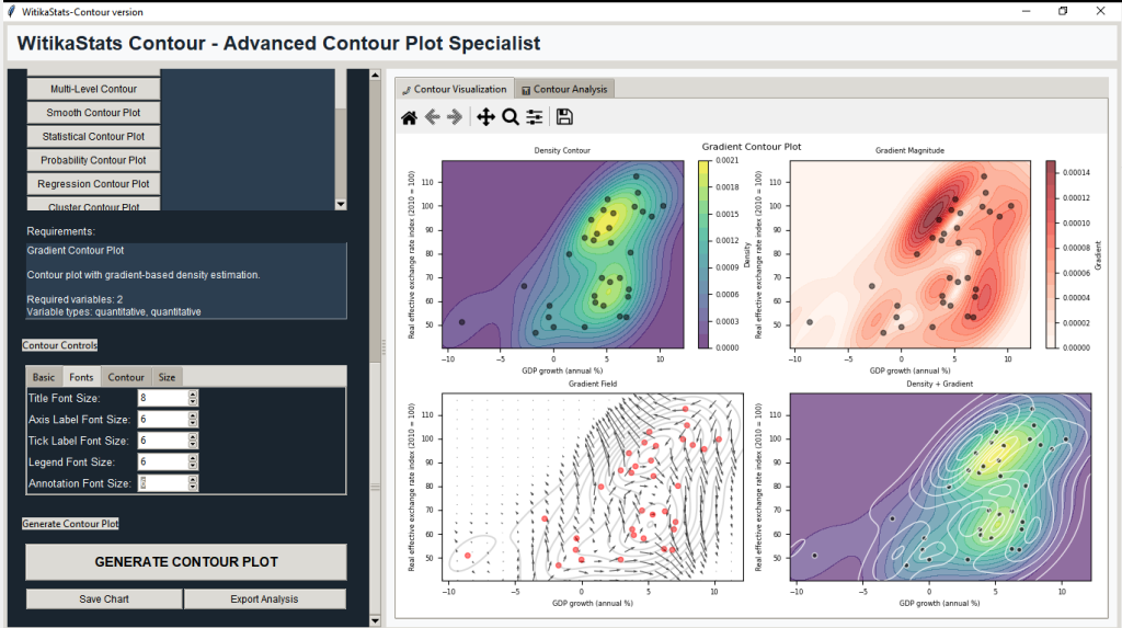
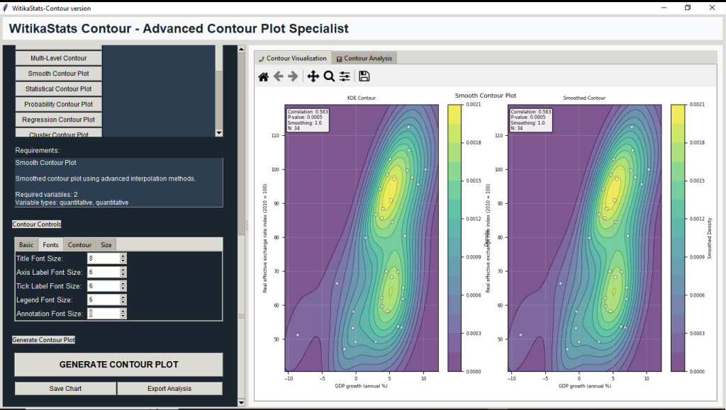
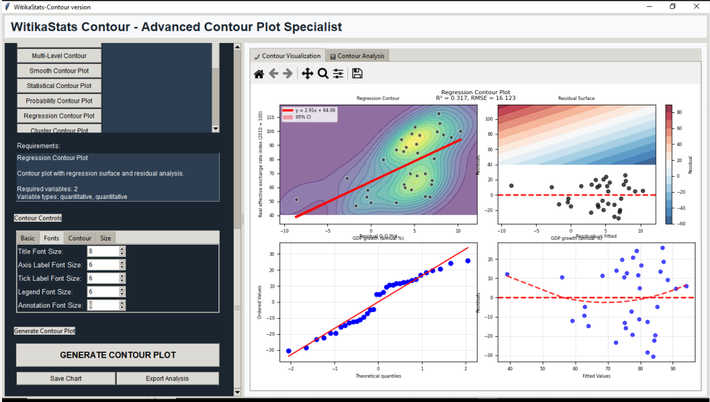
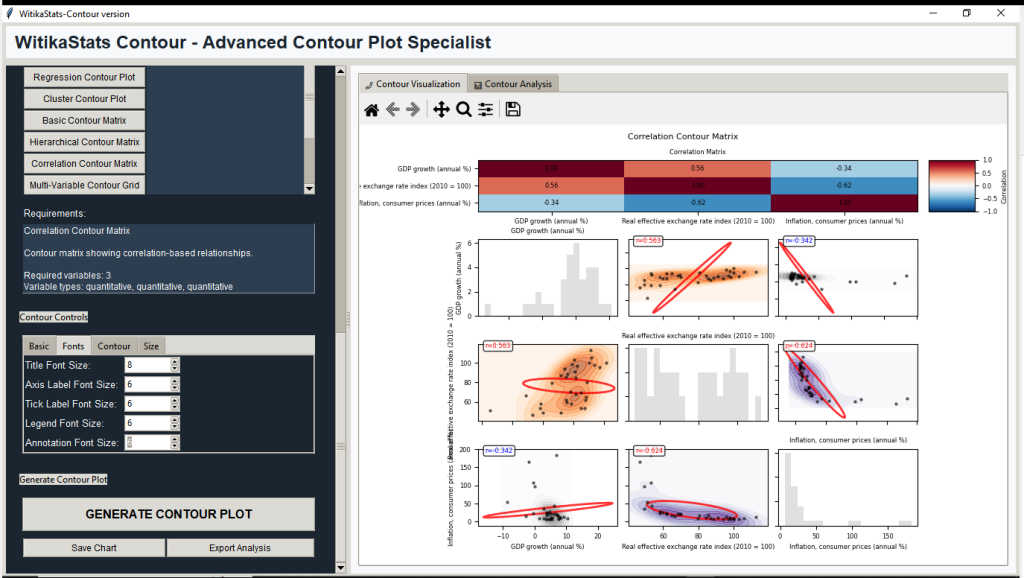
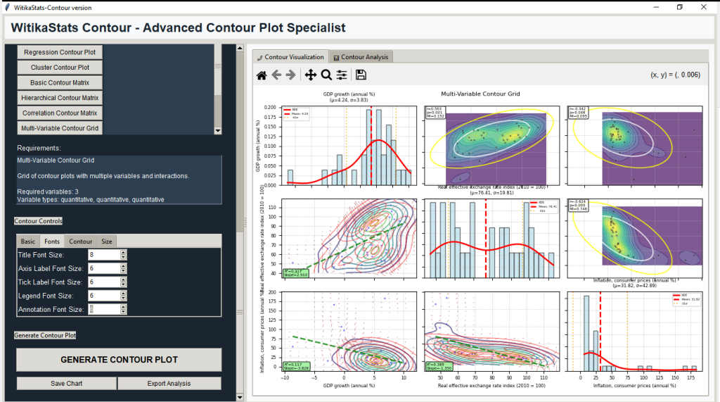
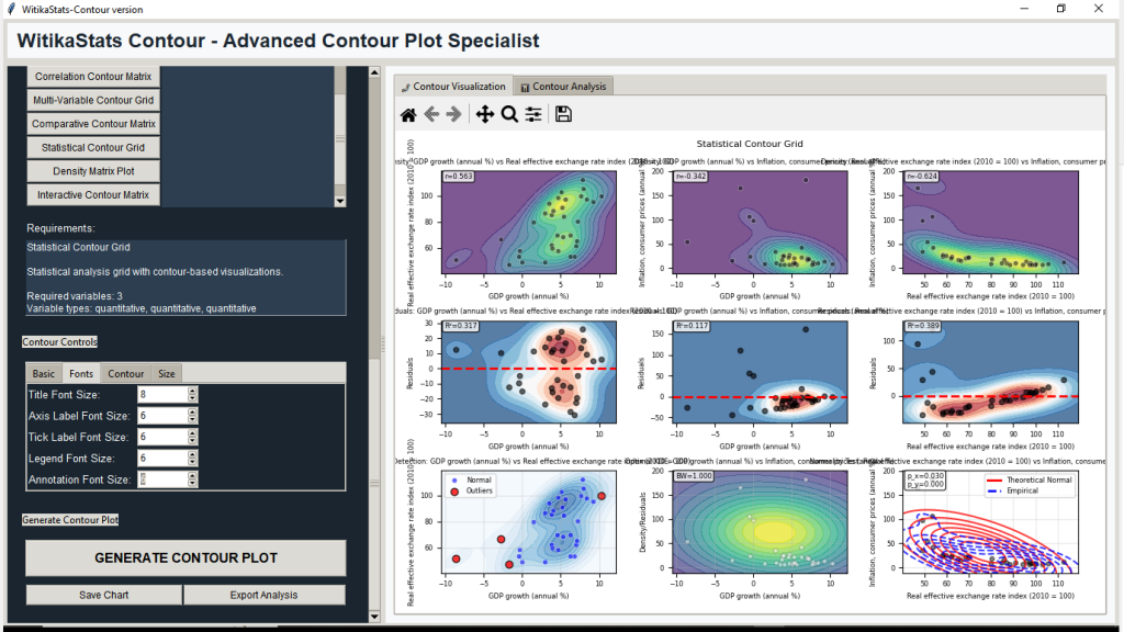
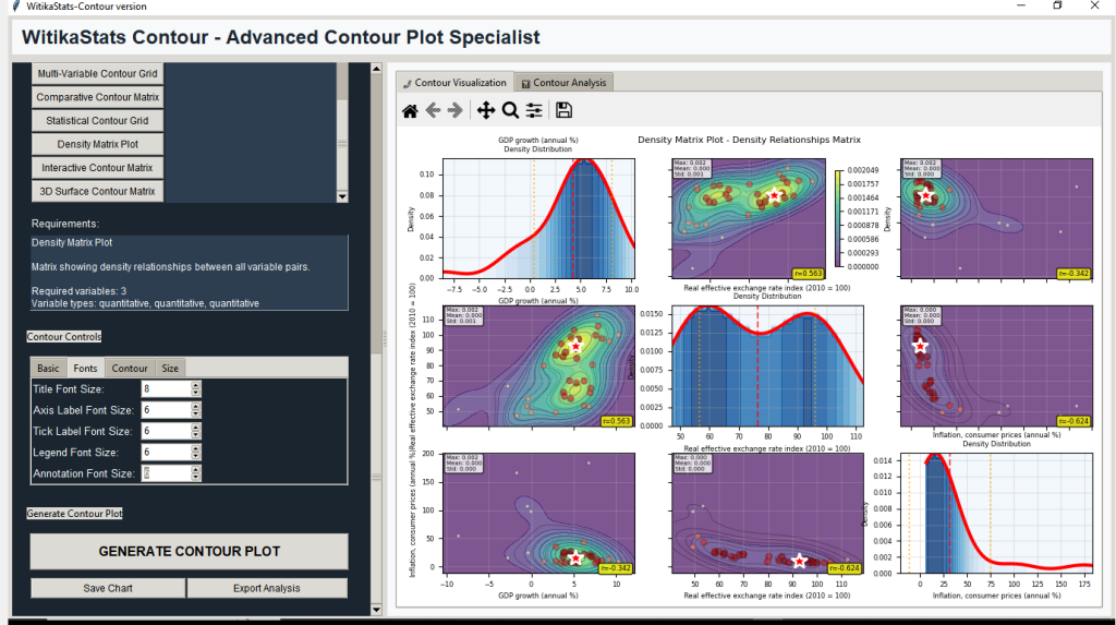
13 | WitikaStats Contour — Advanced Contour Plot Analysis | Density/contour analytics; probability contours, regression surfaces, GMM, clustering contours, KDE bandwidth tuning. |
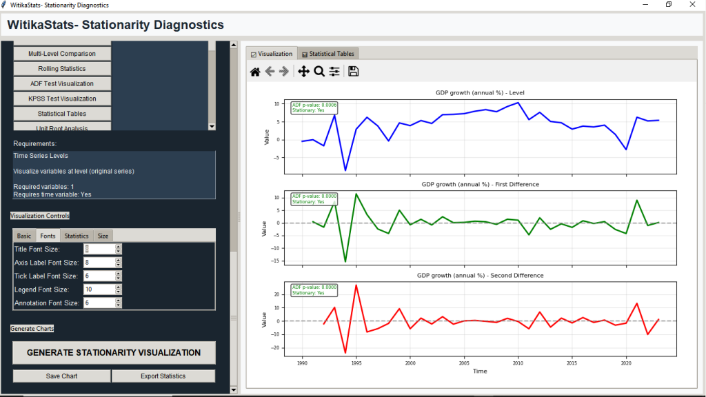
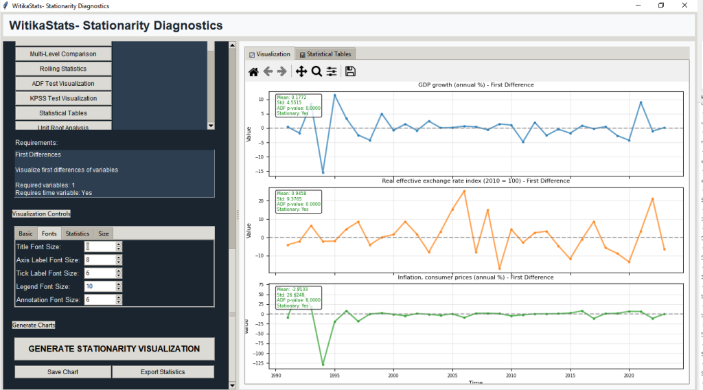
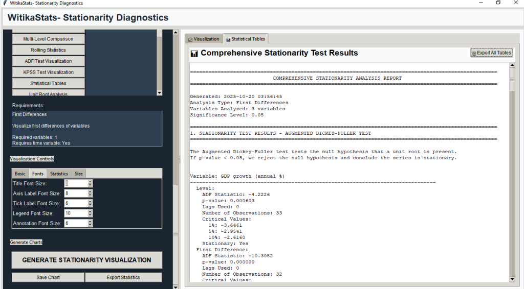
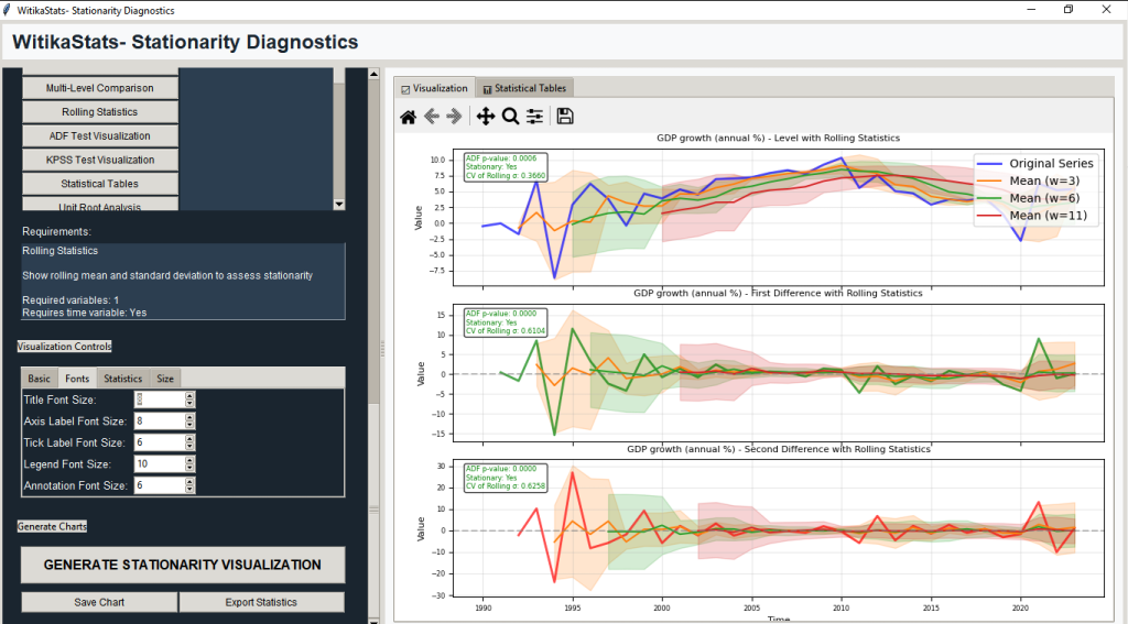
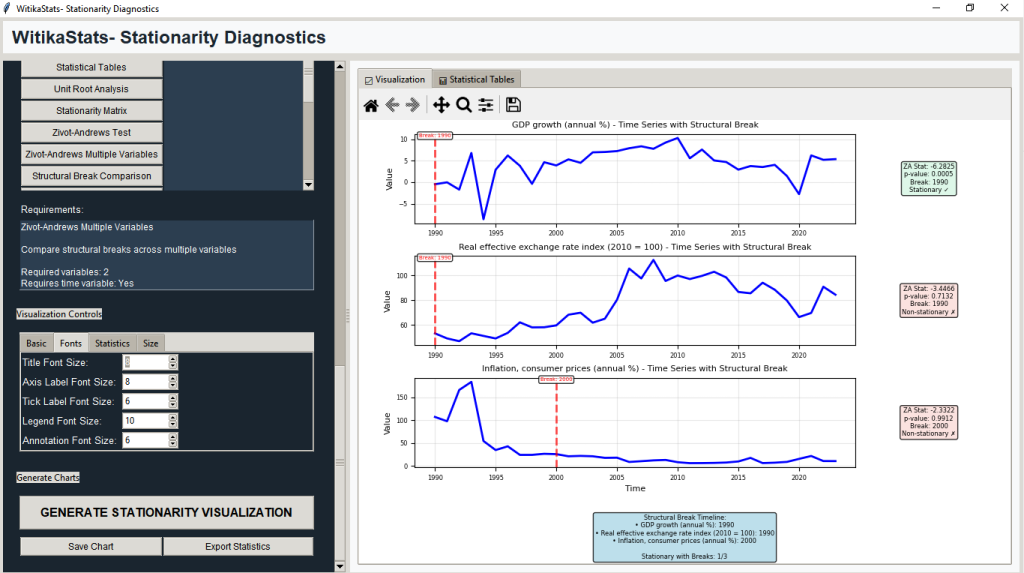
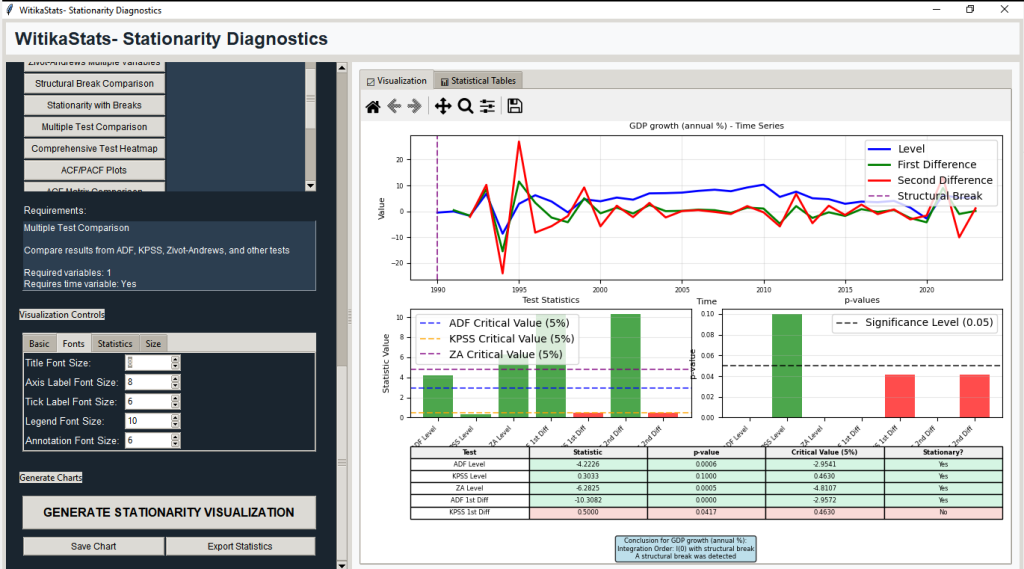
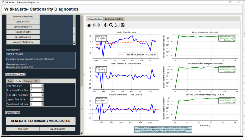
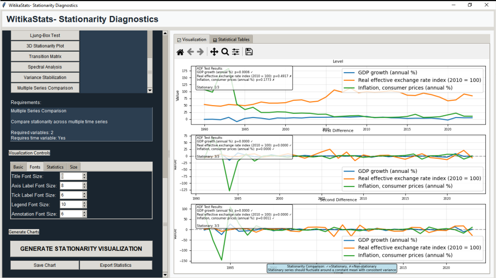
14 | WitikaStats Stationarity Diagnostics | Time series stationarity assessment; ADF/KPSS, Zivot-Andrews, rolling stats, Ljung-Box, Box-Cox transformations. |
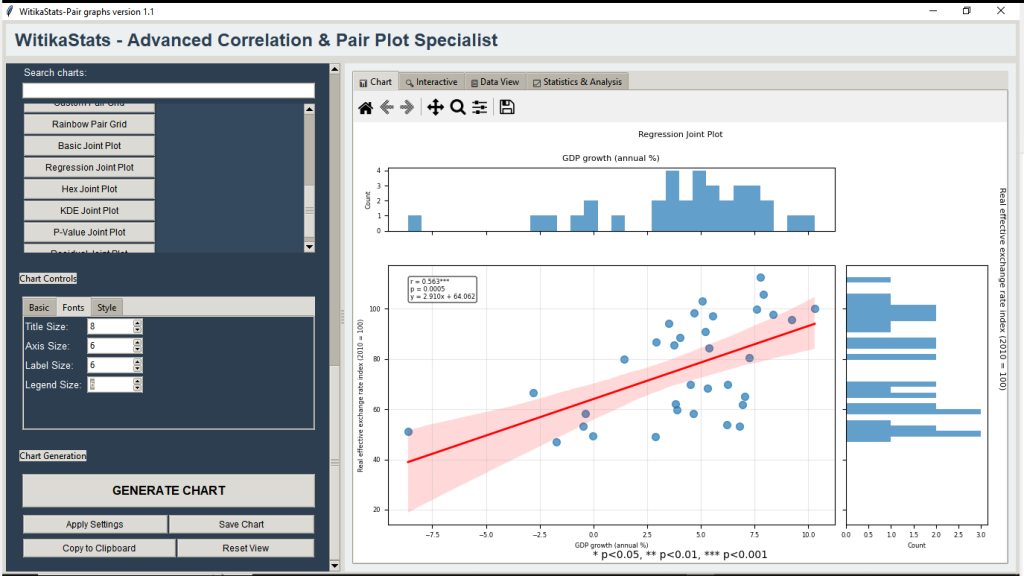
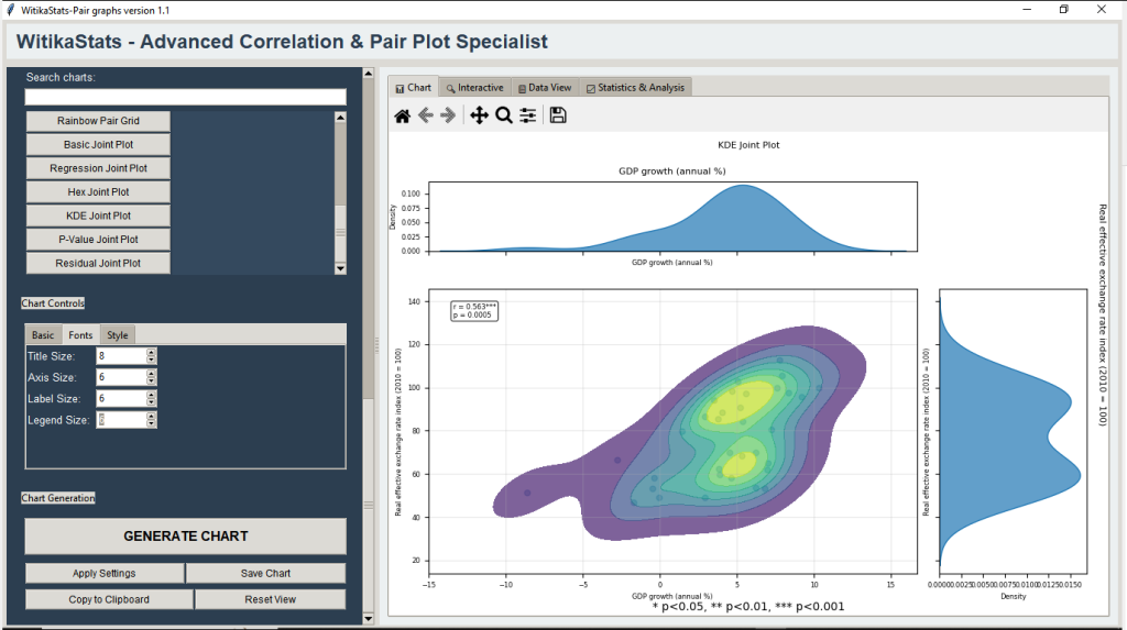
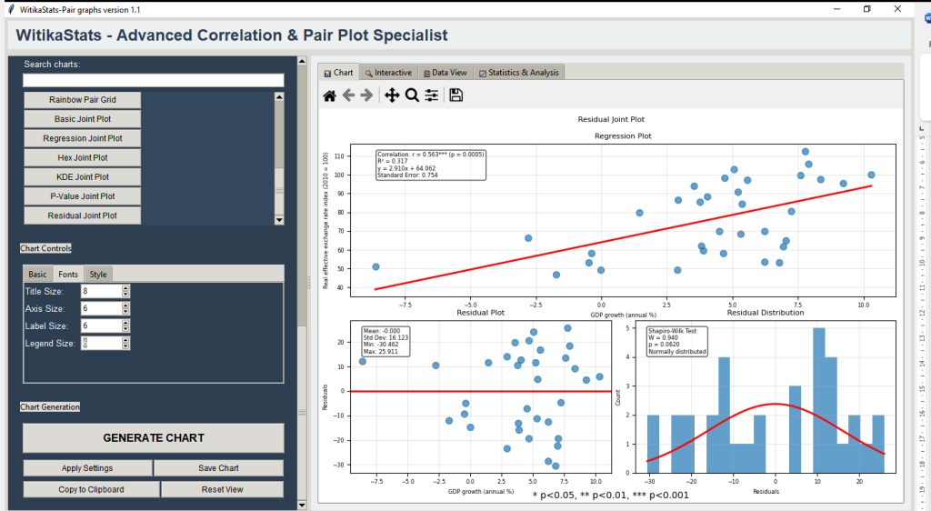
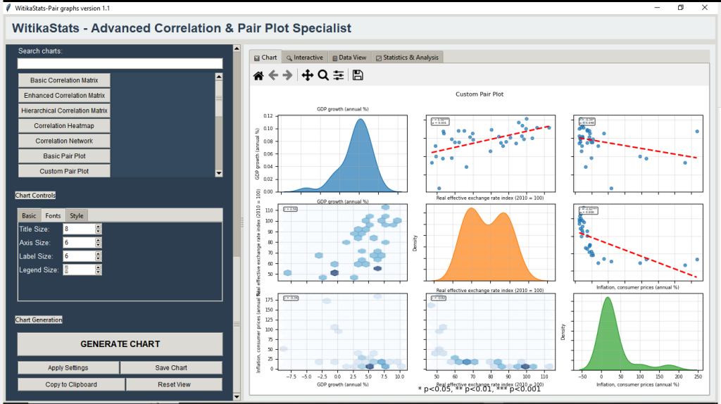
15 | WitikaStats — Advanced Correlation & Pair Plot Specialist | Enhanced scatter/pair grids, joint plots, correlation matrices with inference, ANOVA/chi-square, reproducible reports. |
Witika F‑Correlations — Advanced Correlation Analytics and Visualization Suite
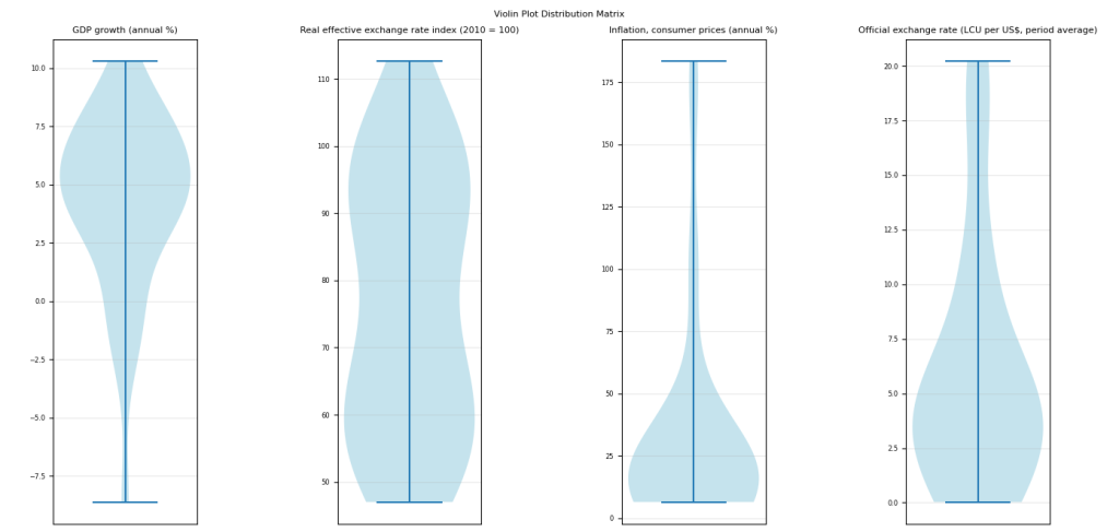
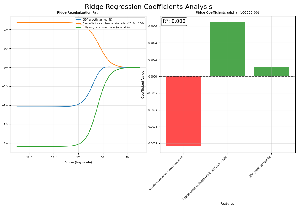
Witika F‑Correlations can give researchers and data scientists a no‑code path to deep relationship analysis, letting them import CSV/Excel, run Pearson/Spearman/Kendall and partial correlations, and visualize uncertainty with p‑values, confidence intervals, and bootstrap/permutation outcomes across 35+ distinctive charts (ellipse plots, networks, arc diagrams, RadViz, ridge plots). Students can grasp concepts like effect sizes and confounding by exploring partial vs. zero‑order correlations and exporting publication‑ready figures. Lecturers and academics can design labs that compare methods (e.g., PCA vs. FA, Pearson vs. Spearman), standardize grading with saved projects, and ensure reproducibility through exportable artifacts. Universities can showcase a signature correlation experience that elevates theses and research outputs. Compared to SPSS, STATA, EViews, or patchwork R scripts, Witika F‑Correlations can stand out by unifying rare visuals, integrated inference, ML augmentation (feature importance, regularization paths), and a full project system—without add‑ons or coding. The suite can shorten time from data to defensible insight, blend statistics with network science and ML, and deliver consistent, high‑resolution outputs ready for journals and presentations.


FitzStatistics — Advanced Analytics for Quantitative, Qualitative, and Mixed Methods
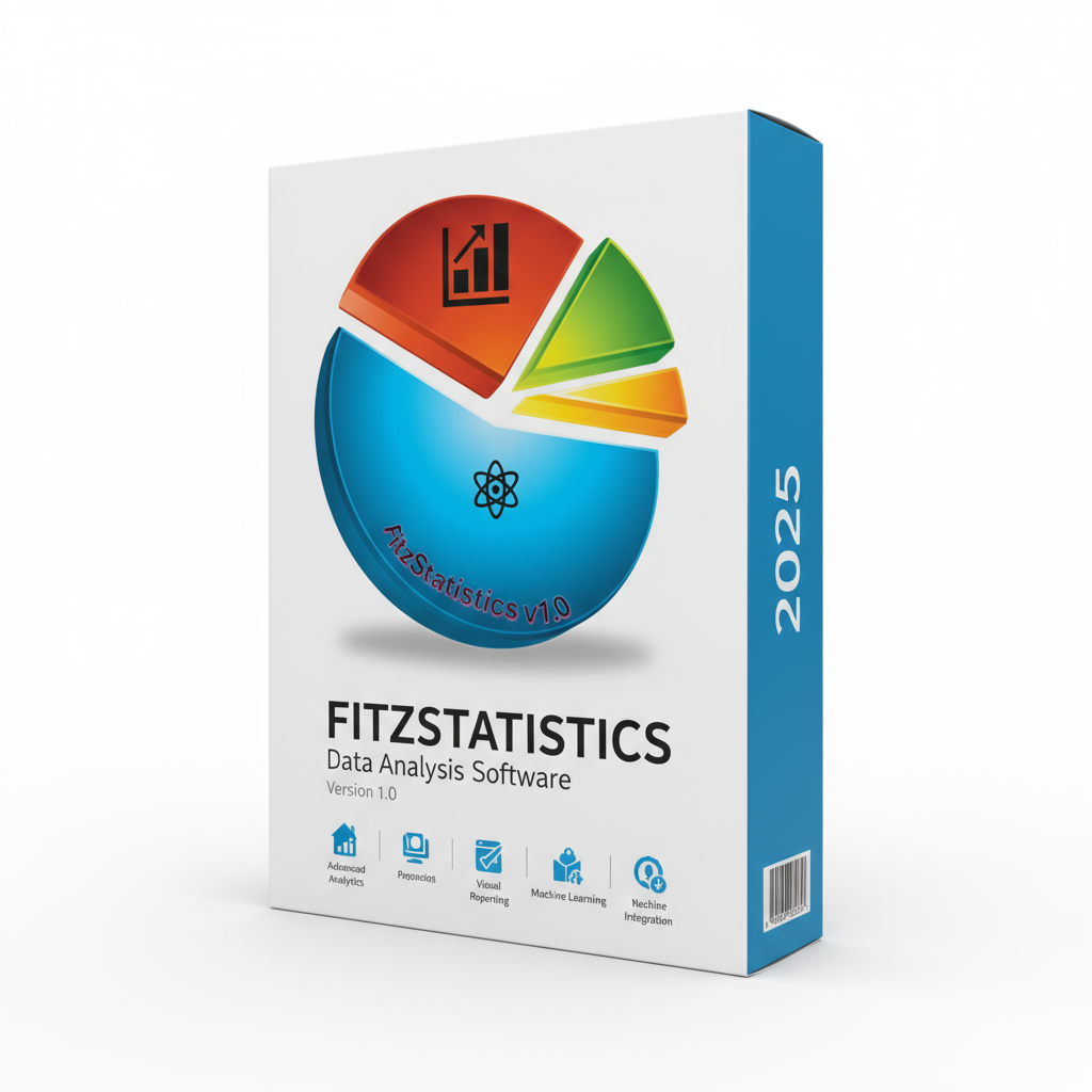
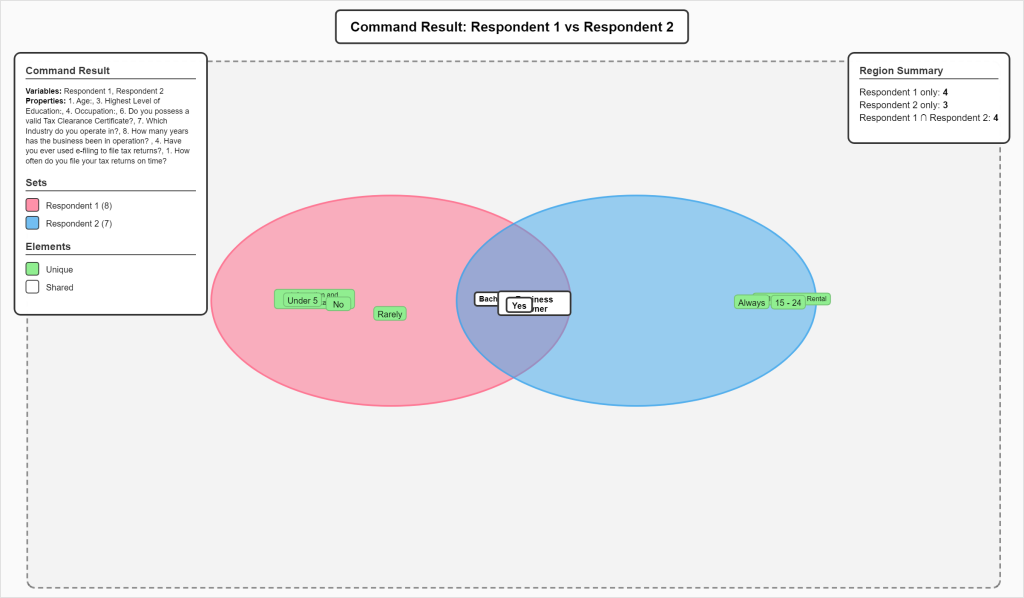
FitzStatistics can provide a single studio for qualitative, quantitative, and mixed‑methods work. Researchers and data scientists can move from descriptive overviews to decision‑oriented evidence using animated visuals, advanced heatmaps, contour analysis, set‑theory diagnostics, and time‑series components—no scripts required. Students can produce publication‑grade visuals while learning multiple paradigms in one interface. Lecturers and academics can build richer labs that connect qual visualizers to quant diagnostics and mixed‑methods synthesis, while standardizing exports and rubrics. Universities can reduce tool switching and training overhead by deploying one platform across departments. Versus SPSS/STATA/EViews (parametric, tabular outputs) and NVivo (coding‑centric), FitzStatistics can differentiate with unified modality coverage and visual‑first analytics. While R can replicate features with code, FitzStatistics can lower barriers with coherent UI design and set‑theory mixed‑methods not commonly available off‑the‑shelf. The platform can accelerate pattern recognition and communication, support policy and applied research with margin‑tuned visuals, and deliver a distinctive look to research outputs and teaching materials.


FitzProanalysis v1.0 — Integrated Time Series, Econometrics, and ML Studio
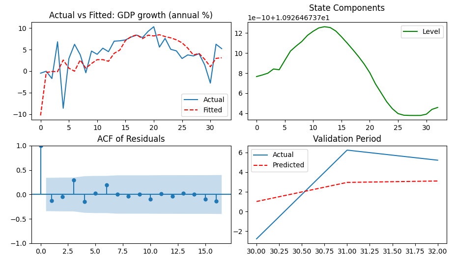
FitzProanalysis can equip campuses with an end‑to‑end lab for forecasting, causal inference, and diagnostics. Researchers and data scientists can import data, set frequency, auto‑tune lags/seasonality, and run ARIMA/SARIMA, VAR/VECM, State Space/Structural, ARMAX, and GARCH pipelines, while viewing ADF/KPSS, Johansen, Granger, Ljung–Box, White/BP, BG, DW, and normality tests. Students can learn best practice by inspecting fit, residuals, and diagnostics side‑by‑side; lecturers can create reproducible labs emphasizing assumptions and model choice; universities can standardize high‑quality workflows across programs. Compared to SPSS, STATA, and EViews, FitzProanalysis can stand out by combining a complete time‑series stack with ML interpretability and 80+ visuals (ACF/PACF, decompositions, IRF/FEVD, spectral, learning/validation curves, PDP/ICE), all exportable. R can match pieces via scripts; FitzProanalysis can streamline them in one GUI with a project system that preserves every setting for auditability. The result can be faster forecasting, clearer diagnostics, publishable figures, and stronger methodological rigor in theses and research.


Fitzeconomic Games v1.1 — Applied Game Theory Software
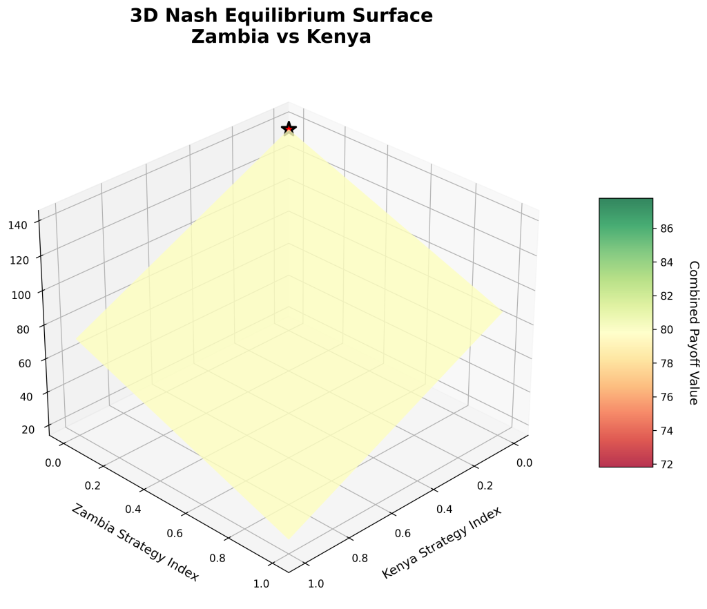
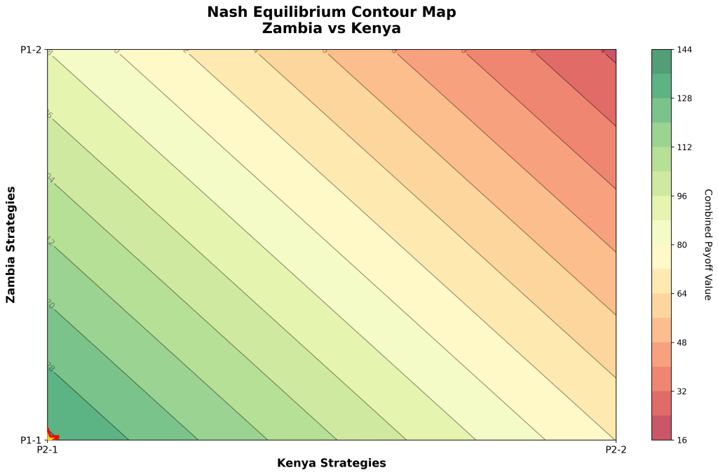
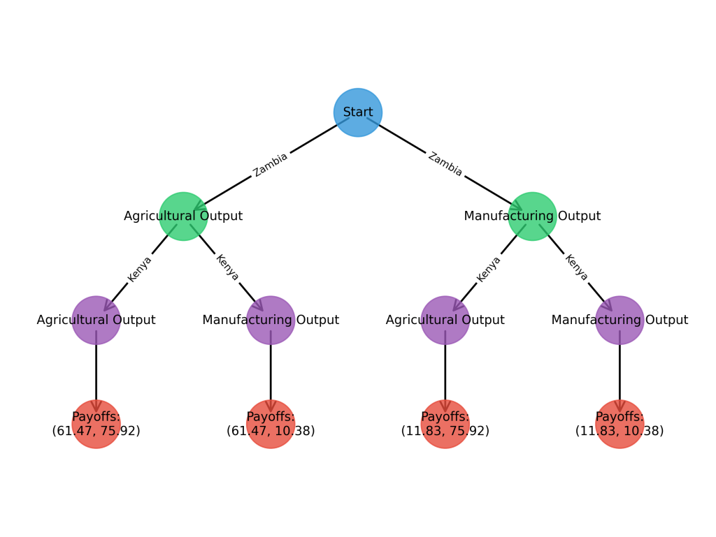
Fitzeconomic Games can turn real datasets into strategic insight. Researchers and data scientists can define 2–6 player games, map qualitative labels to numeric scales, set strategies, compute pure‑strategy Nash equilibria, and visualize results via payoff matrices, decision/game trees, and Nash maps. Students can make concepts tangible by experimenting with best responses, payoff geometry, and equilibria over time. Lecturers and academics can build guided labs for IO, trade, and competition policy, documenting assumptions (preferences, mappings) for reproducibility. Universities can run policy simulations and showcase applied game theory without coding. Where SPSS/STATA/EViews lack dedicated equilibrium modeling and annotated strategic visuals, Fitzeconomic Games can provide an integrated, no‑code workflow. While R can reproduce analyses with multiple packages, this studio can reduce setup time and ensure consistent, high‑quality exports. The platform can lower the barrier to strategic modeling, bridge qualitative and quantitative inputs, and enable transparent, reproducible strategy assessments for teaching and early‑stage research.


WitikaPythonalysis v1.1 — Advanced Qualitative and Mixed Methods Visualization Studio
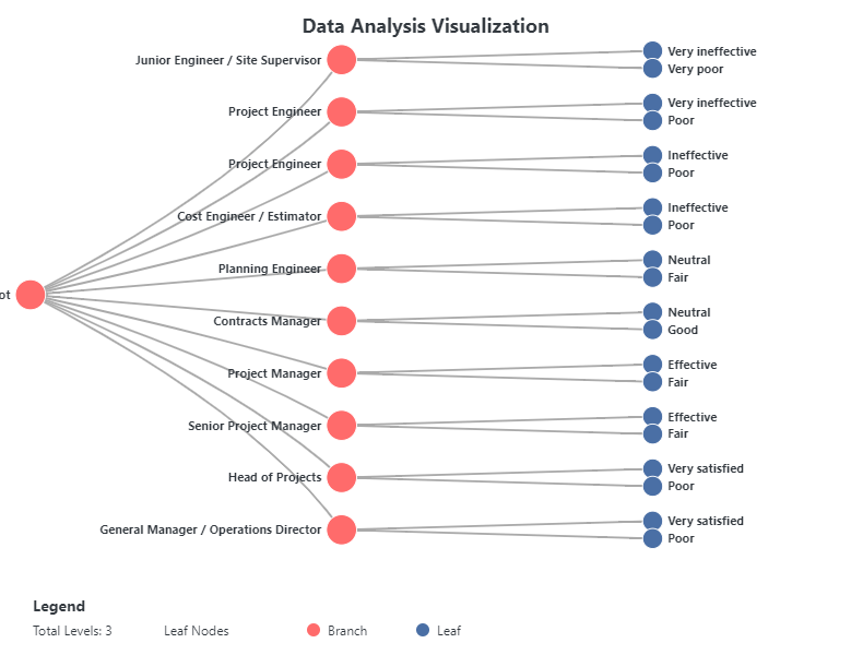
WitikaPythonalysis can give teams 70+ no‑code visuals for qualitative, categorical, and mixed datasets. Researchers can map concepts, co‑occurrence, and similarity; pivot to clustering and structural views; and export publication‑ready figures. Students can learn visual inference by toggling encodings (presence/absence, similarity, numeric), aided by smart fallbacks when conversion is messy. Lecturers and academics can design labs that connect content analysis to structure—e.g., concept networks to dendrograms—while standardizing outputs and rubrics. Data scientists can rapidly profile categorical/text data to inform modeling choices. Compared to SPSS/STATA/EViews (limited mixed‑methods visuals) and NVivo (coding‑centric), WitikaPythonalysis can stand out with breadth, a coherent UI, and reliable export options. R can achieve similar results with multiple libraries; this studio can reduce integration overhead and deliver consistency. Institutions can speed discovery, enhance reporting, and support reproducibility by saving selections and settings, making it easier to scale qualitative/mixed‑methods analytics across courses and research teams.


Witika Literature Search Engine (WLSE) — Evidence Discovery and Research Mapping Studio
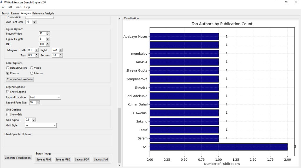
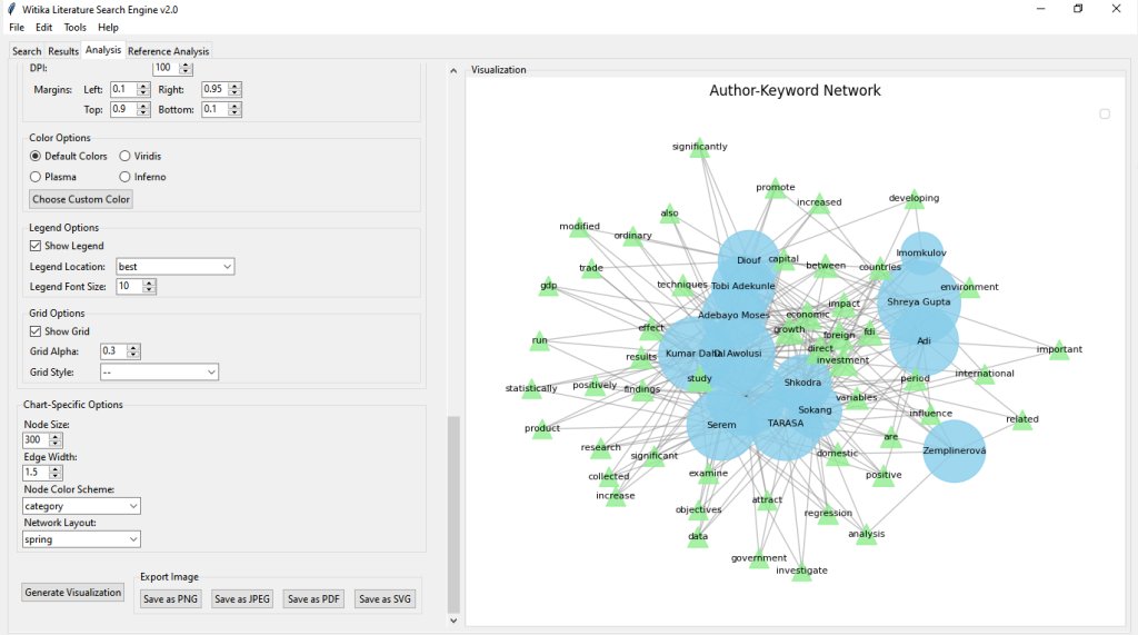
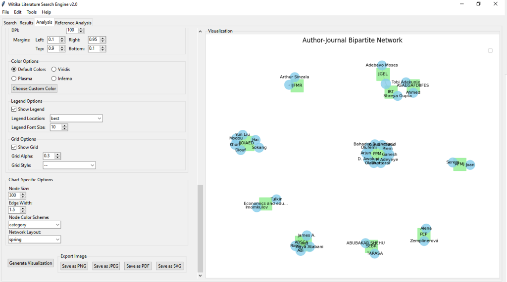
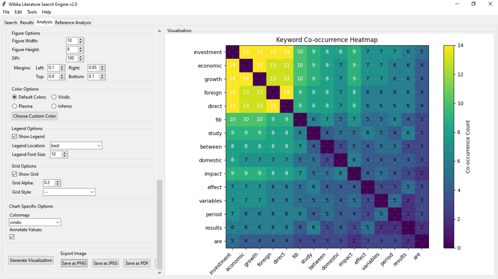
WLSE can streamline literature discovery, screening, annotation, and analysis in one place. Researchers can query Crossref, enrich records with citations/references, and generate timelines, co‑authorship/co‑citation networks, author–keyword bipartite graphs, Sankey flows, and journal similarity matrices. Students can accelerate scoping reviews by tagging methodology and theory and exporting publication‑ready figures and tables. Lecturers and academics can standardize reading lists, gap analyses, and supervision via shared project files. Universities can map research strengths, inform strategy, and raise review quality. Unlike SPSS/STATA/EViews (modeling‑focused) or NVivo (coding‑focused), WLSE can specialize in literature intelligence with fast bibliometrics and networked flows. R and bibliometric packages can perform parts with code; WLSE can offer an end‑to‑end, no‑code pipeline, smart fallbacks for messy metadata, and responsive filtering. This studio can shorten time‑to‑topic, improve transparency, and deliver distinctive research maps for proposals, accreditation, and departmental showcases.


Witika Machine Learning — No‑Code Modeling, Explainable AI, and Visualization
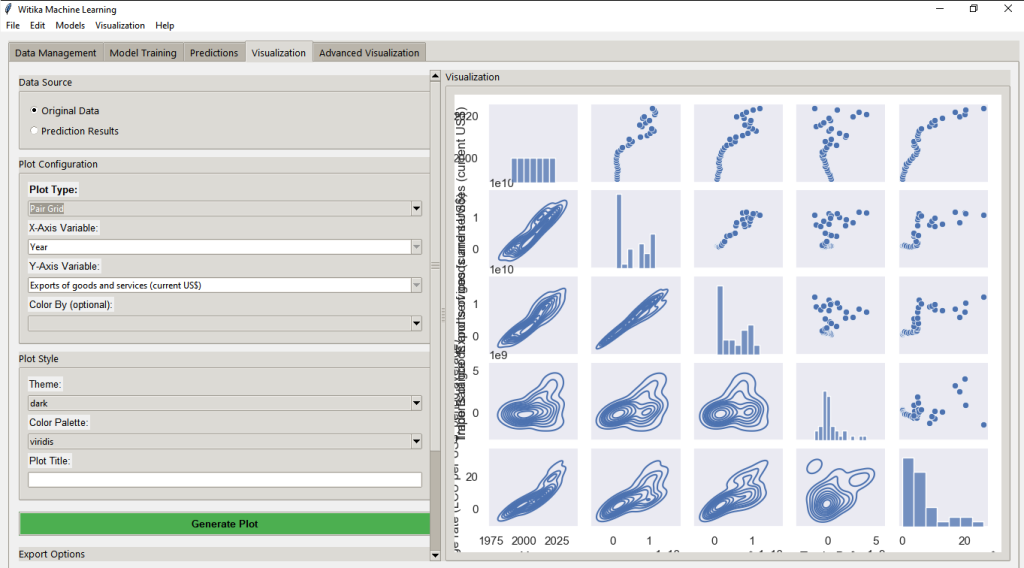
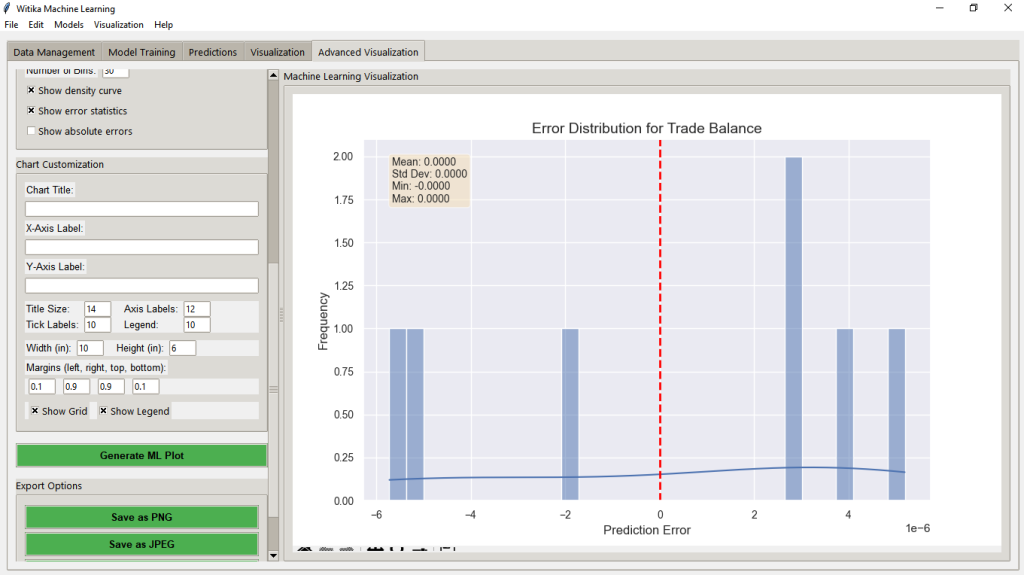
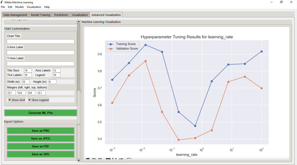
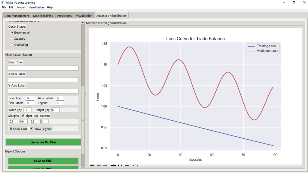
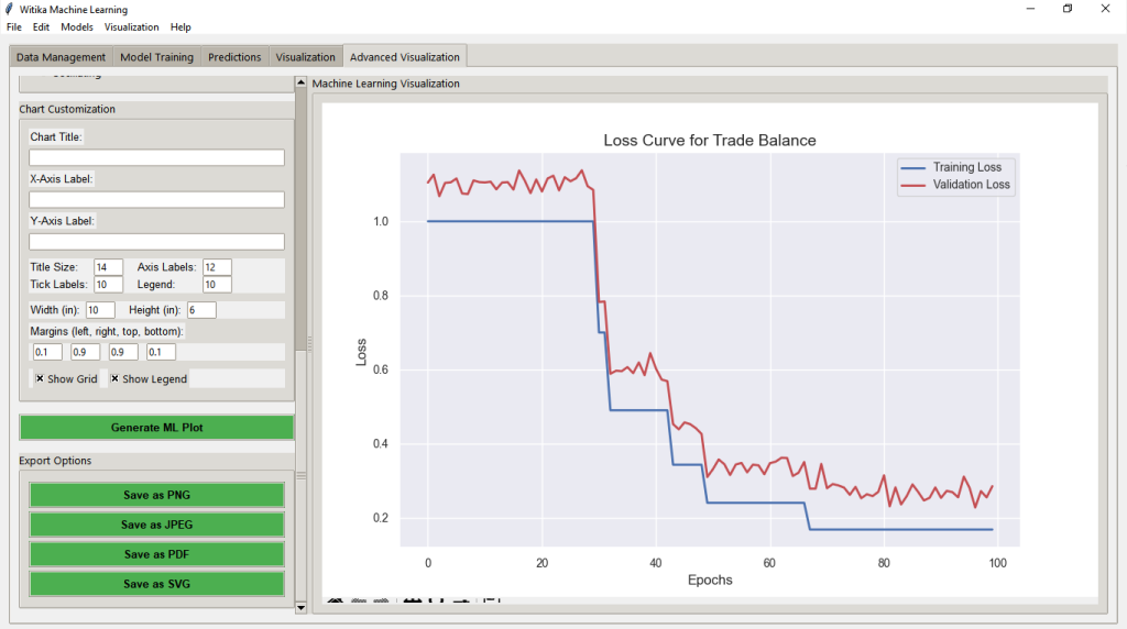
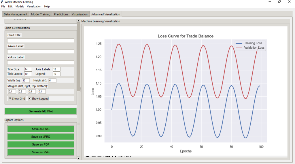
Witika ML can provide a complete ML workflow without coding. Researchers and data scientists can profile, clean, encode, and train models across regression/classification, run k‑fold CV, and compare algorithms (linear/logistic, regularized, trees/forests/GBMs, SVM, k‑NN, MLP). They can generate ROC/PR, calibration, learning/validation curves, confusion matrices, PDP/ICE, SHAP summaries, dimensionality reduction (PCA, t‑SNE, UMAP), clustering, and tree plots. Students can learn bias–variance and threshold trade‑offs by watching metrics update; lecturers can build reproducible labs on fairness, interpretability, and model stability. Universities can standardize ML pedagogy and governance while broadening access. Compared to SPSS/STATA/EViews (limited ML, more syntax for pipelines/diagnostics), Witika ML can unify preprocessing, model selection, and explainability in a guided GUI with publication‑ready exports. R can match capabilities with curated packages and code; this platform can reduce integration overhead and ensure consistent documentation and visuals for theses, research, and consultancy.


WitikaStats — Standard Version
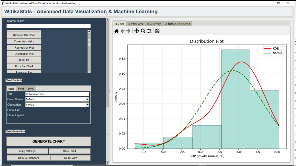
WitikaStats can turn raw datasets into clear, defensible narratives. Researchers and data scientists can clean/profile data and draw from a wide chart catalog—multivariate, networks, spatiotemporal, and presentation‑ready visuals—while seeing contextual statistics (distributions, correlations, effect sizes, group summaries, outlier diagnostics). Students can improve visual literacy and export Word/Excel‑ready tables and high‑resolution figures. Lecturers and academics can design labs and demonstration dashboards with standardized formats and reproducible settings. Universities can elevate internal/external reporting with modern interactive and publication‑grade visuals. Versus SPSS/STATA/EViews (strong inference, slower custom visuals) and R (powerful but code‑heavy), WitikaStats can offer a visual‑first, no‑code experience that unifies EDA, storytelling, and statistical context. The suite can reduce friction from import to delivery, ensure consistency across outputs, and help teams communicate evidence quickly and persuasively.


WitikaStats — Time Series Analysis Suite
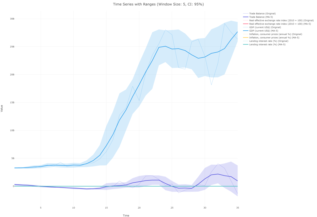
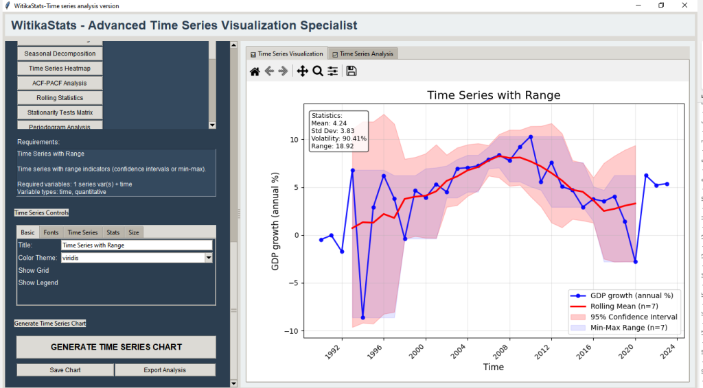
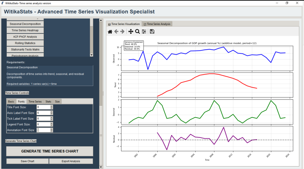
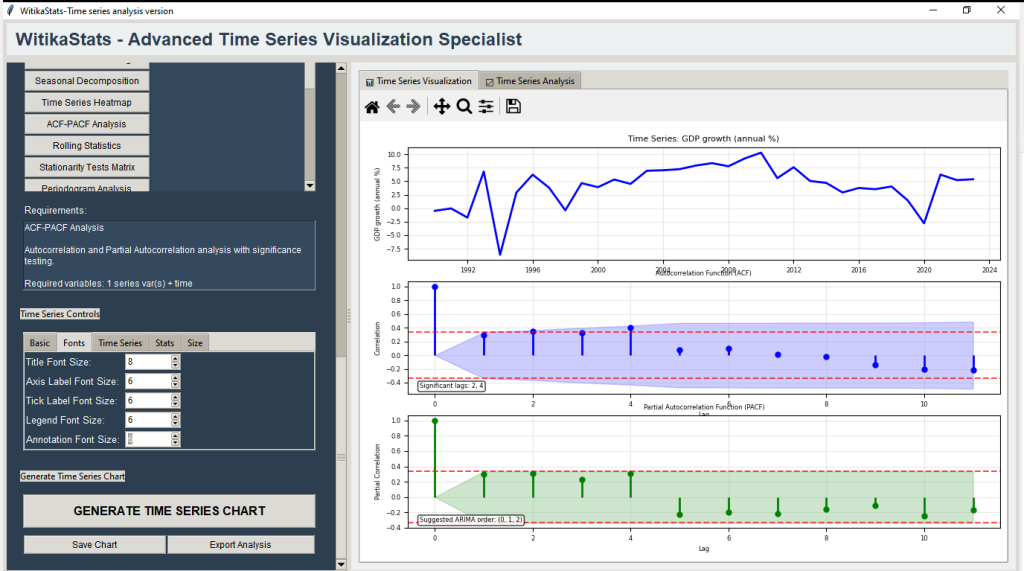
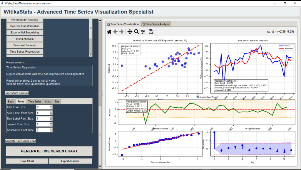
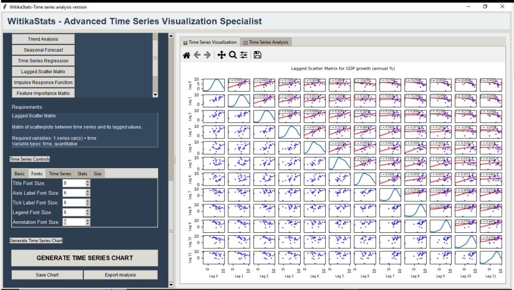
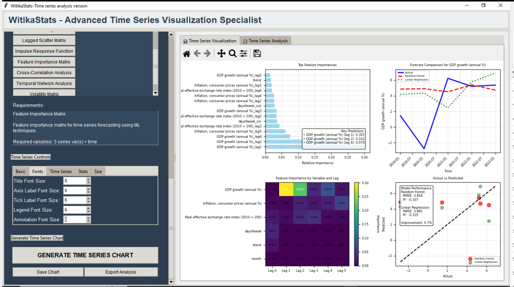
This WitikaStats edition can specialize in rigorous time‑series workflows. Researchers and data scientists can explore decomposition, ACF/PACF, ARIMA/Holt‑Winters forecasting, rolling statistics/OLS, trend breaks, clustering, cross‑correlation, lagged scatter matrices, dynamic factor models, and temporal networks—supported by ADF/KPSS, periodograms, and residual checks. Students can learn stationarity and model selection with clear, side‑by‑side visuals; lecturers can build reproducible labs with comprehensive Excel reports; universities can embed best practice across programs. Compared to SPSS/EViews and menu‑driven STATA, this suite can integrate broader diagnostics and modern visuals in a point‑and‑click UI with auto date parsing and high‑resolution exports. R can do the same with code; WitikaStats can centralize the workflow, speed iteration, and standardize outputs. The result can be faster, more defensible time‑series analyses for economics, finance, epidemiology, agriculture, and operations.


WitikaStats Scatter Matrix — Advanced Correlation & Relationship Analysis Suite
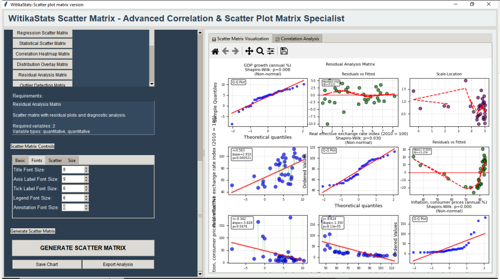
WitikaStats Scatter Matrix can deliver 20 enhanced matrices for pairwise and multivariate exploration. Researchers and data scientists can use confidence ellipses, LOWESS, rolling/partial correlations, density/KDE overlays, PCA/clustering overlays, 3D projections, and method comparisons. Students can detect outliers, nonlinearity, heteroscedasticity, and multicollinearity; lecturers can scaffold labs from Pearson to partial correlations and PCA with reproducible reports. Universities can standardize robust relationship analysis via one‑click exports and Excel tables. Compared to SPSS/EViews’ basic matrices and STATA’s code‑heavy overlays, this suite can integrate significance flags, effect sizes, normality/outlier diagnostics, residual plots, and hierarchical clustering for variable ordering. R can replicate pieces with multiple libraries; WitikaStats can minimize setup and ensure consistent, publication‑quality figures. The suite can shift focus from static heatmaps to concept‑driven inquiry and defensible visual inference.


WitikaStats ML Visualization — No‑Code Machine Learning Insight Suite
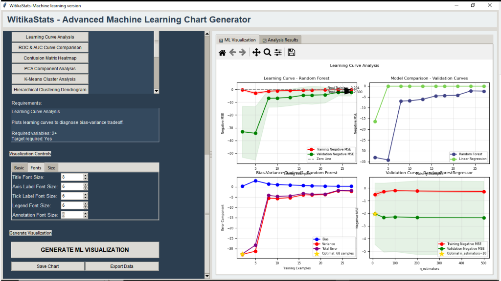
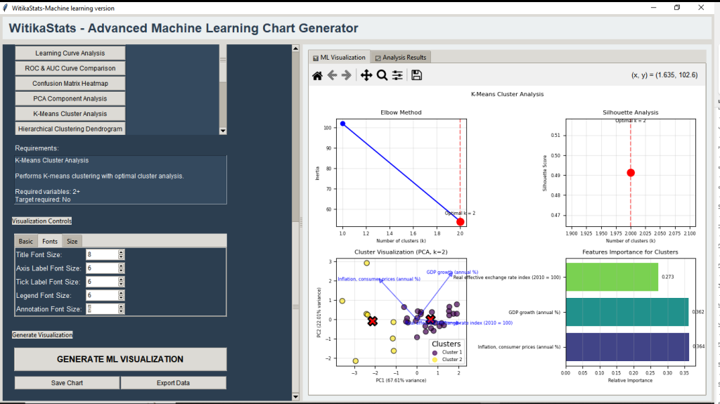
This suite can focus on ML diagnostics and pedagogy. Researchers and data scientists can compare models via leaderboards, learning/validation curves, ROC‑AUC/PR, calibration, confusion dashboards, residual analysis, decision boundaries, and hyperparameter heatmaps (with 3D/parallel coordinates). Unsupervised tools can include PCA biplots, t‑SNE/UMAP, clustering with silhouette/CH/DB scores, dendrograms, and anomaly detection comparisons. Students can internalize bias–variance, class imbalance, and thresholding; lecturers can build stepwise labs from fundamentals to tuning with reproducible, parameter‑tracked reports. Compared to SPSS/EViews (limited ML) and STATA (often scripting for curves/tuning), this suite can centralize explainability without code. R can achieve depth with effort; WitikaStats can offer curated visuals and consistent exports. The differentiator can be clarity: surfacing why models behave (over/underfit, interactions, stability) and how features contribute, upgrading ML rigor across disciplines.


WitikaStats Correlation Ellipse Plotter — Visual Inference for Relationships
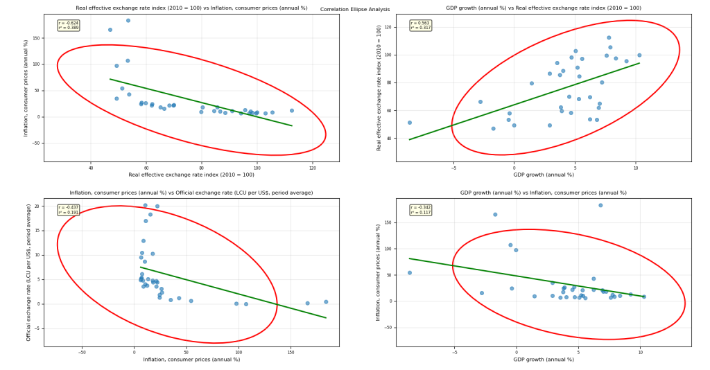
The Correlation Ellipse Plotter can bring uncertainty and effect sizes into first‑look visuals. Researchers can render multi‑level confidence ellipses/ellipsoids, regression with confidence/prediction bands, partial correlations (controlling covariates), robust ellipses (MCD, Theil–Sen, RANSAC), KDE/theoretical ellipses, and time‑evolving shapes. Students can see how outliers and uncertainty reshape relationships; lecturers can design labs that progress from basic to robust and time‑varying ellipses; data scientists can spot leverage points and suppression/mediation signals quickly. Universities can adopt standardized, defensible figures with exportable tables (descriptives, correlations, ellipse parameters). Versus SPSS/EViews’ static plots and STATA’s code‑dependent overlays, this tool can integrate Fisher’s z comparisons, bootstrap intervals, eigenvectors/principal axes, and diagnostics into a single no‑code workflow. R can replicate with multiple packages; the Plotter can streamline production and ensure consistent, publication‑ready outputs.


WitikaStats Contour — Advanced Contour Plot and Density Analysis Suite
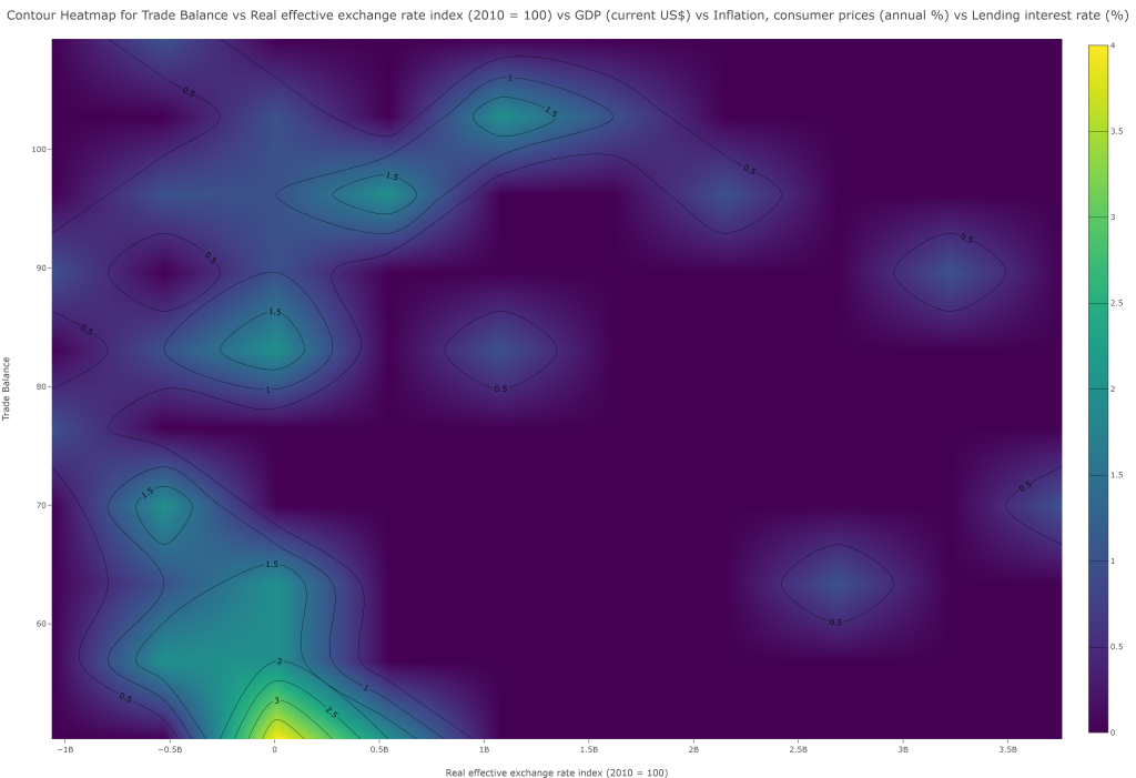
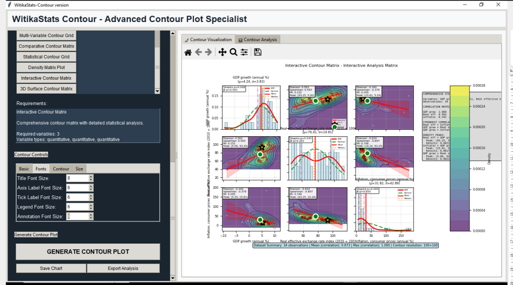
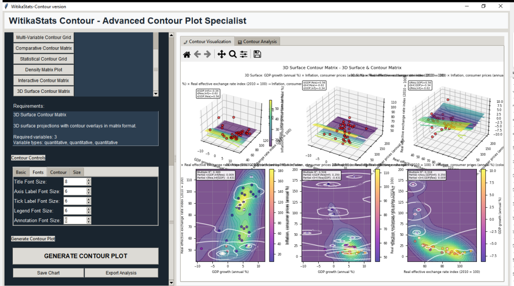
WitikaStats Contour can turn multivariate data into interpretable density and probability landscapes. Researchers can use KDE with bandwidth tuning, Mahalanobis/chi‑square confidence regions, gradient fields, GMM contours, regression surfaces with residual diagnostics, clustering contours, and pairwise contour matrices with hierarchical reordering and mutual information guidance. Students can learn modality, gradient flow, and robustness; lecturers can build labs from basic density to probability/confidence contours and 3D hybrids; data scientists can test model fit and reveal nonlinear dependence. Universities can standardize density diagnostics with exportable tables and high‑resolution, consistently styled figures. Compared to SPSS/EViews’ basic density tools and STATA’s scripting needs, this suite can deliver method depth without code. R can match with curated libraries; WitikaStats can reduce integration costs and enforce reproducible settings, clarifying where models may fail and where structure persists.


WitikaStats — Advanced Correlation & Pair Plot Specialist
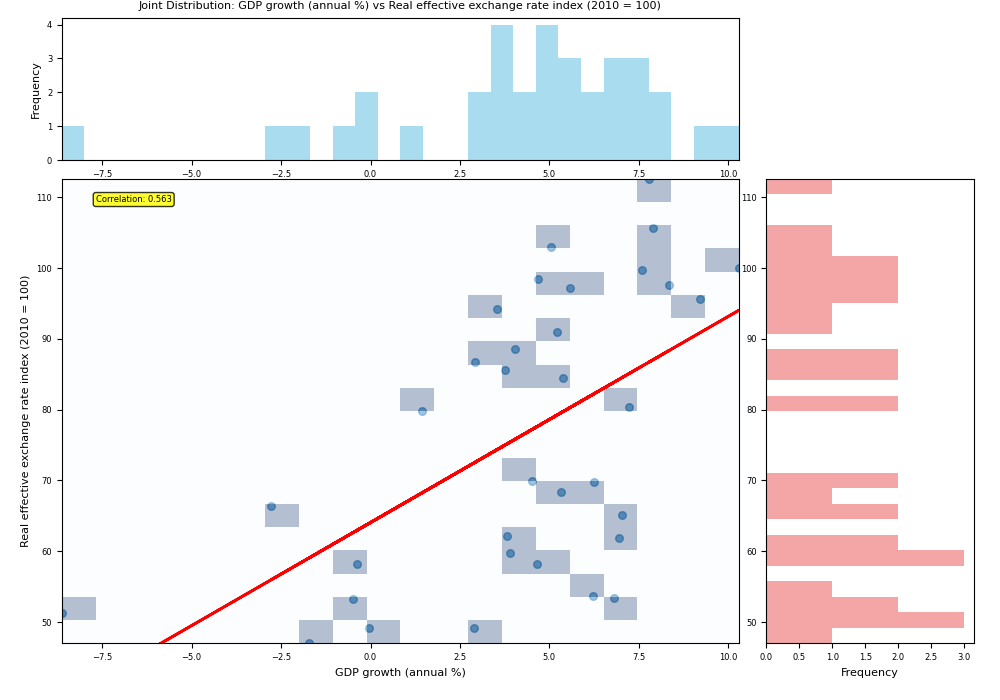
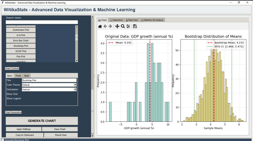
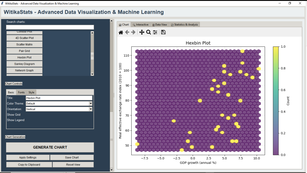
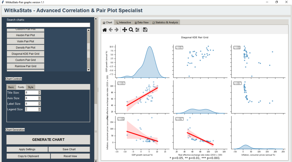
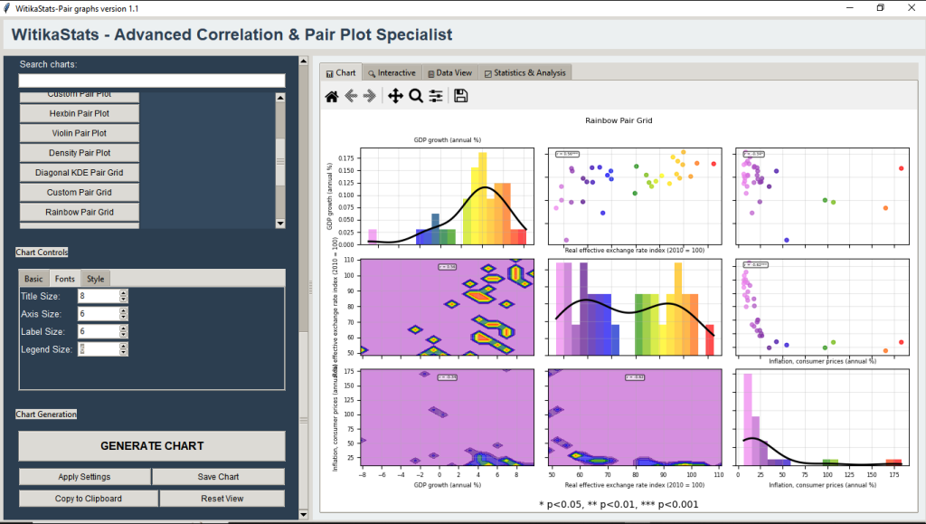
WitikaStats — Advanced Correlation & Pair Plot Specialist can give researchers, students, lecturers, academics, data scientists, and universities a fast, no‑code path from CSV/Excel to defensible relationship insights. You can auto‑detect variable types, generate enhanced correlation matrices (Pearson/Spearman/Kendall) with p‑values and significance stars, reorder variables via hierarchical clustering, and move seamlessly into pair plots/grids and joint plots (scatter, hexbin, KDE, heatmap) with embedded statistics (r, p, R², regression equations, residual diagnostics, normality/Q–Q checks). You can analyze mixed data too—contingency tables with chi‑square/Cramér’s V and one‑way ANOVA with eta‑squared—then export polished figures (PNG/PDF/SVG/HTML) and audit‑ready tables (Excel/CSV, Word‑friendly text). You can standardize pedagogy and reporting with saved settings, chart history, and parameter‑tracked reports to make grading and replication easy. Compared to SPSS, STATA, and EViews (basic matrices, syntax for advanced overlays) or R (powerful yet integration‑heavy), WitikaStats can centralize advanced correlation storytelling—hexbin and contour grids, regression‑annotated pair panels, interactive Plotly heatmaps and networks—in one coherent GUI, reducing tool switching and training while elevating clarity, reproducibility, and publication‑grade output for theses, courses, and research.


WitikaStats Stationarity Diagnostics — Visual and Statistical Stationarity Testing
Stationarity Diagnostics can provide fast, transparent answers to “Is my series stationary?” Researchers can examine levels/differences, rolling means/variance, ADF/KPSS with on‑plot p‑values and thresholds, Zivot–Andrews break detection, ACF/PACF, Ljung–Box, spectral analysis, and transformation guidance (log, sqrt, Box–Cox, differencing). Students can internalize concepts via clear pass/fail annotations and pre/post‑break comparisons; lecturers can standardize labs with exportable Excel reports and high‑resolution figures; data scientists can rapidly vet ARIMA readiness and feature engineering. Universities can lift methodological rigor and reproducibility across programs. Versus SPSS/EViews/STATA, this tool can centralize diagnostics, structural break handling, and recommendation summaries in a no‑code interface. R can do all steps with scripts; Stationarity Diagnostics can remove integration overhead and ensure audit‑ready outputs, accelerating forecasts, strengthening theses, and improving publication quality.


Leave a Reply